



Cecil Lee
Staff
-
Joined
-
Last visited
-
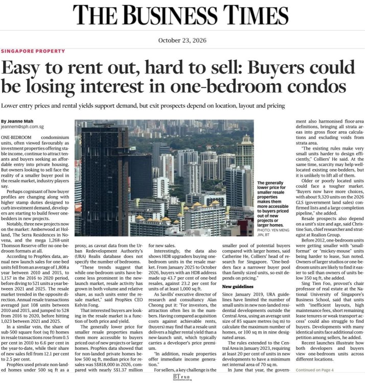
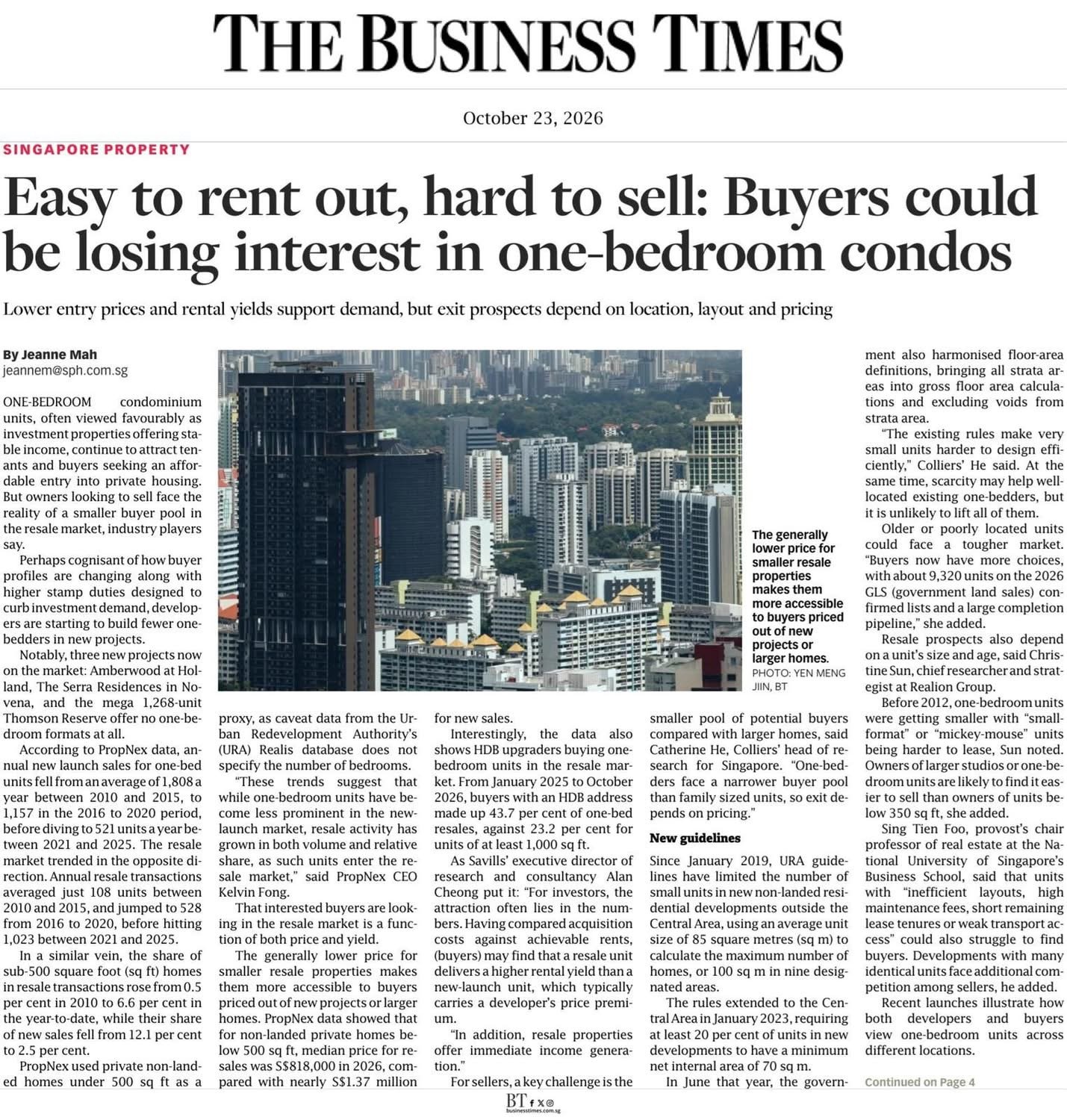
Singapore Property Market: Why 1-Bedroom Condos Are Easy to Rent but Hard to Sell One-bedroom condos in Singapore are still popular for investors because they are affordable to buy and easy to rent out for steady income. However, current owners are discovering that these small units are hard to sell later on because fewer buyers are looking for tiny homes. Because buyer preferences are changing, property developers are starting to build fewer one-bedroom units in their new projects. Sales for brand-new one-bedroom condos have dropped over the last few years. Interestingly, while new sales are down, people are still buying one-bedroom condos in the resale (second-hand) market. This is mainly because resale units are much cheaper than brand-new ones, and buyers can start collecting rent immediately. Looking forward, government rules have made it stricter to build very small units. Real estate experts warn that older one-bedroom condos with bad layouts, high fees, or poor locations will be the hardest to sell in the future.
-
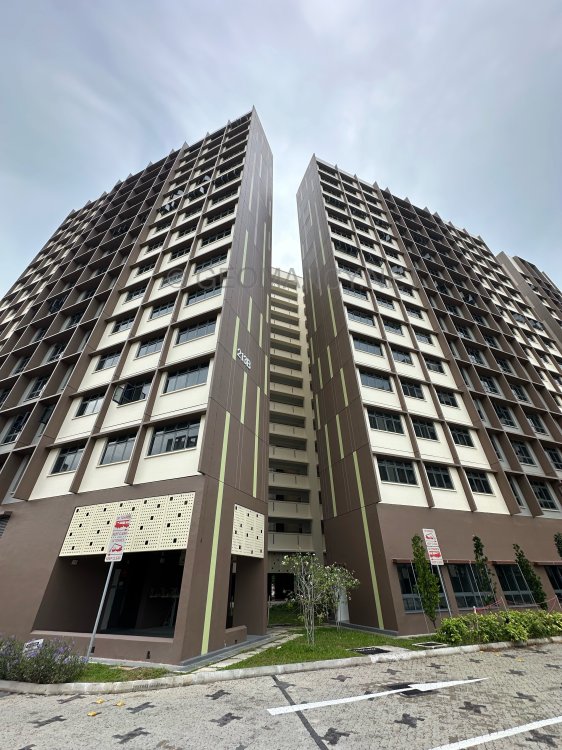
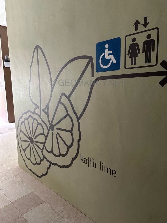
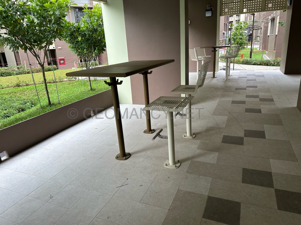
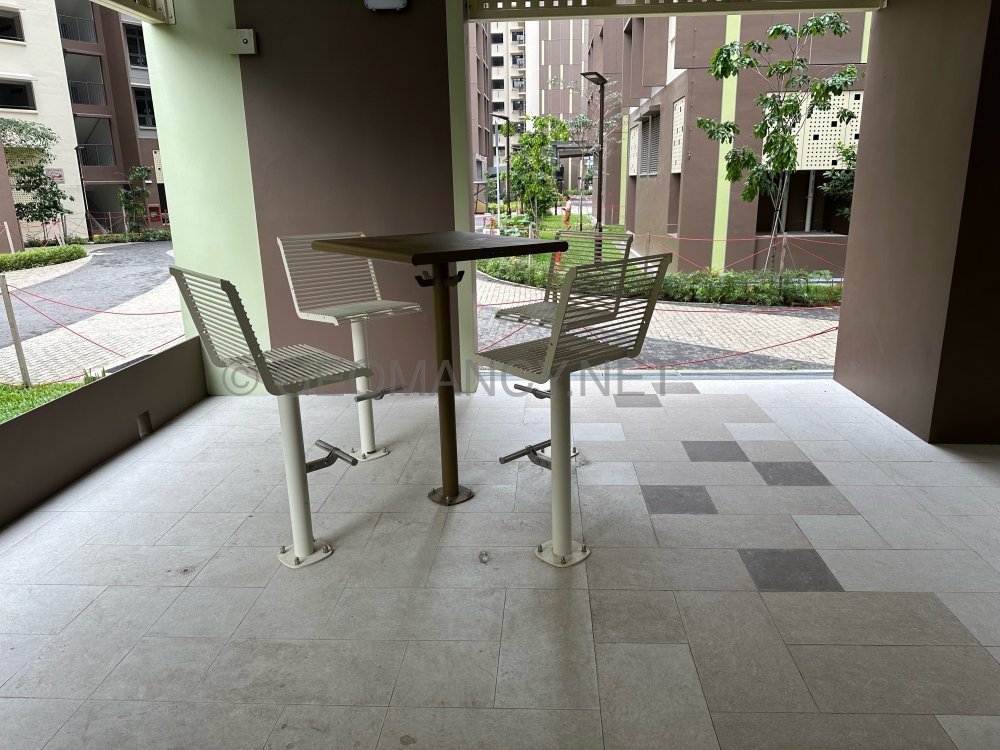
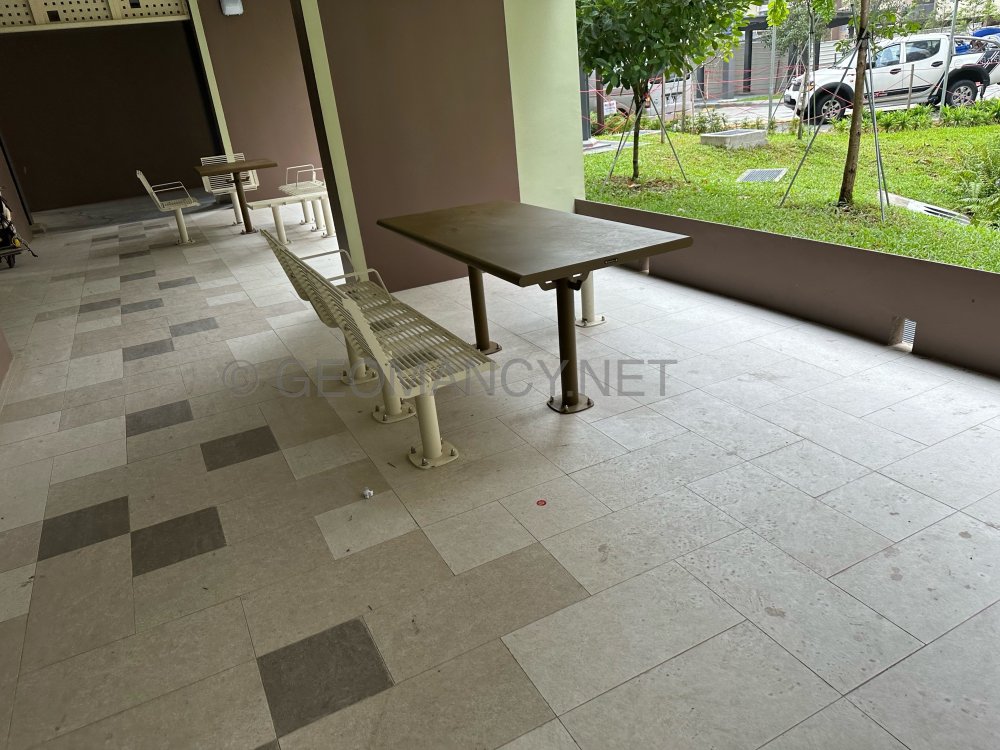
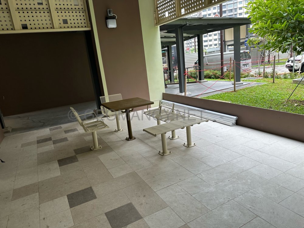
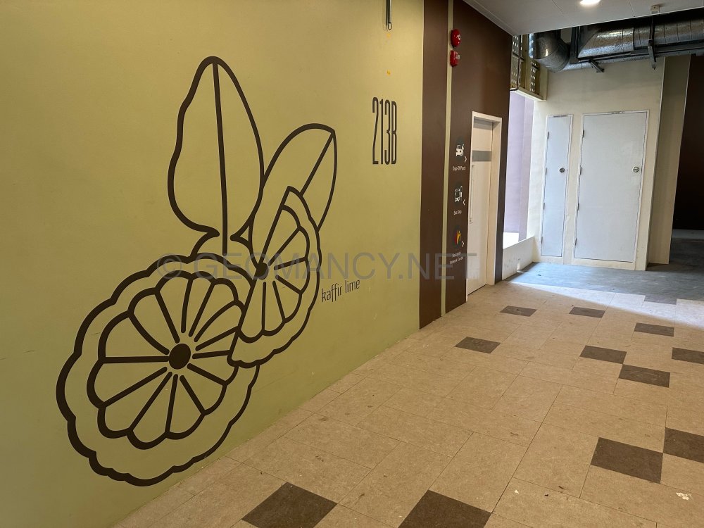
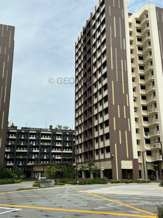
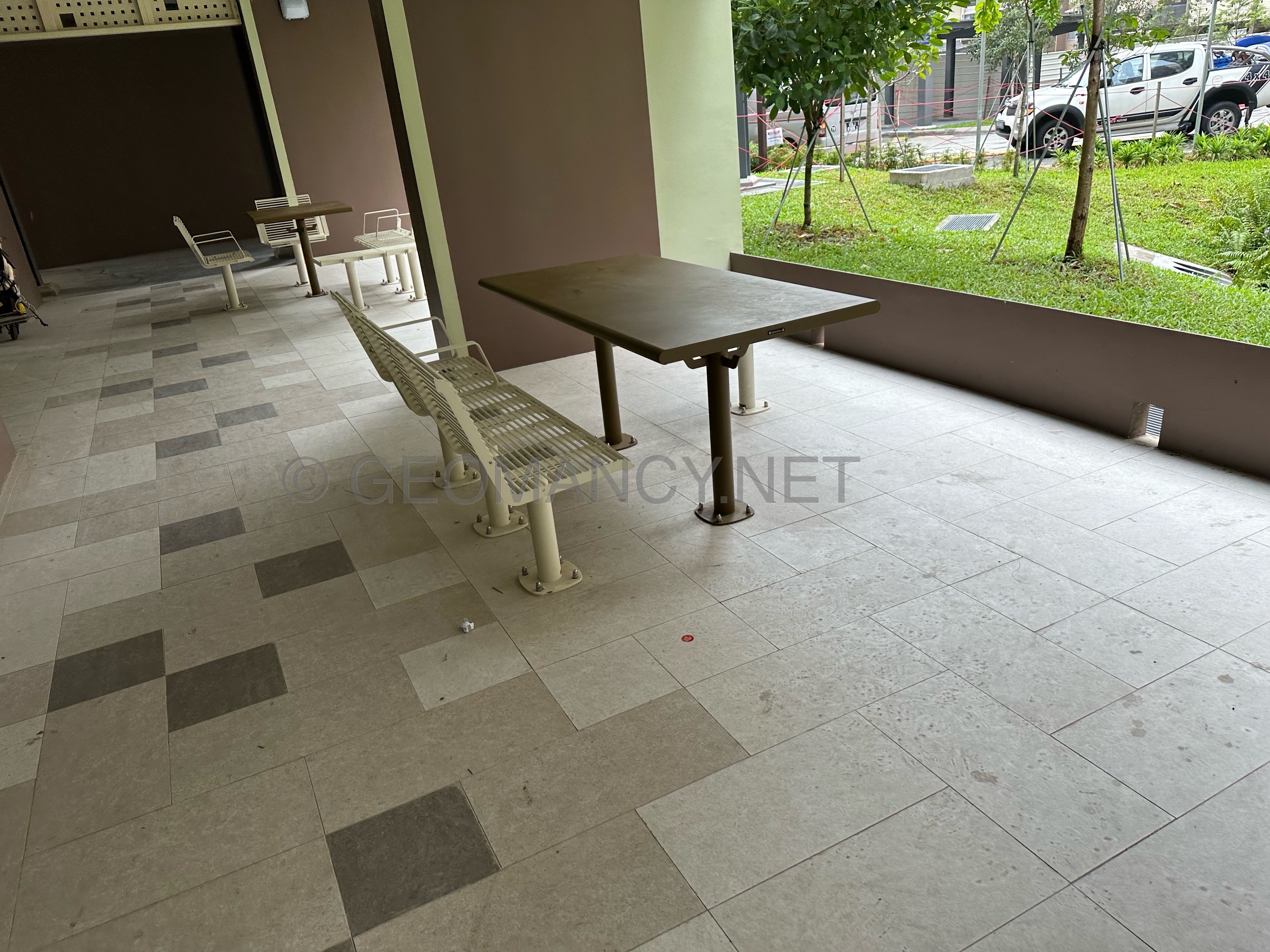
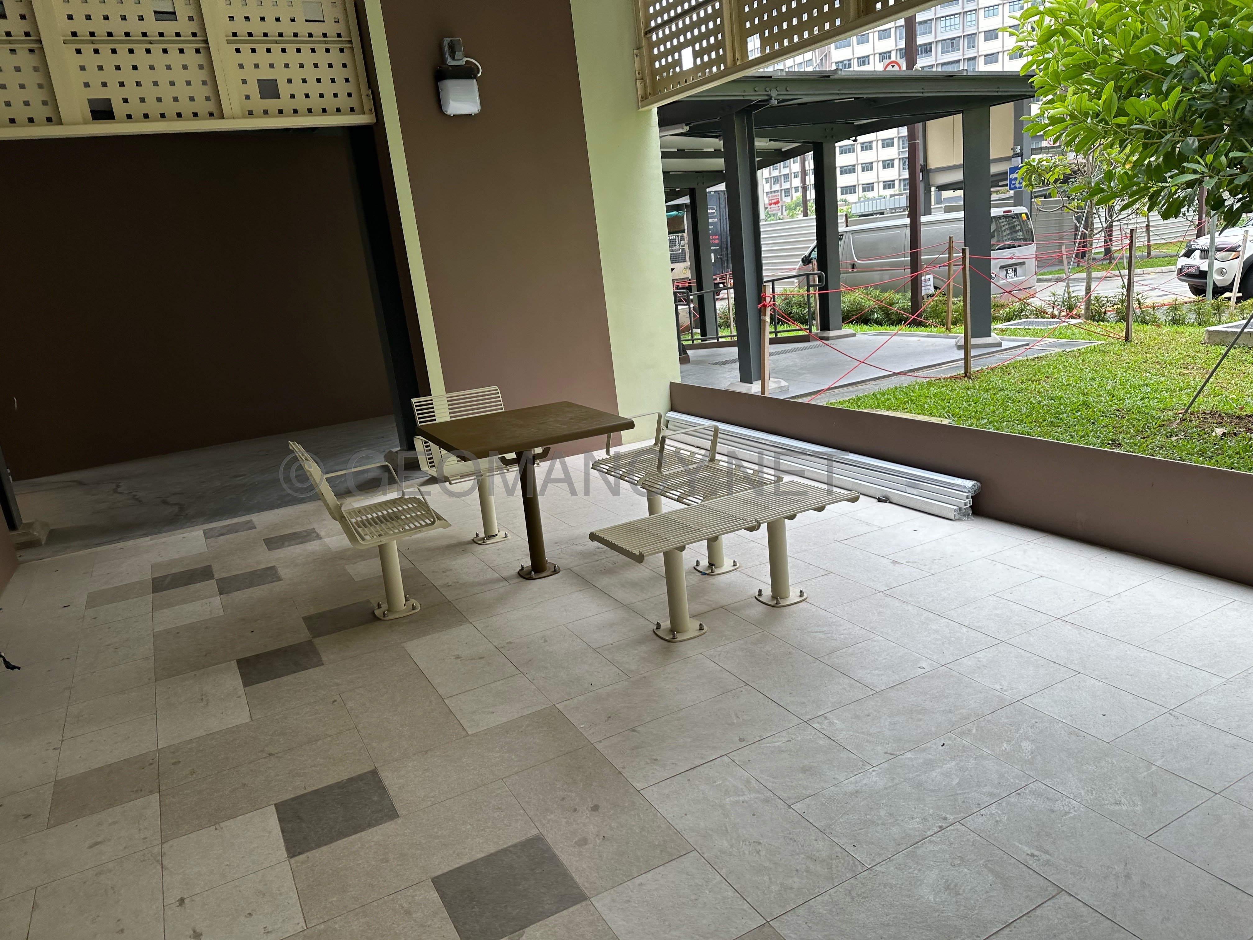
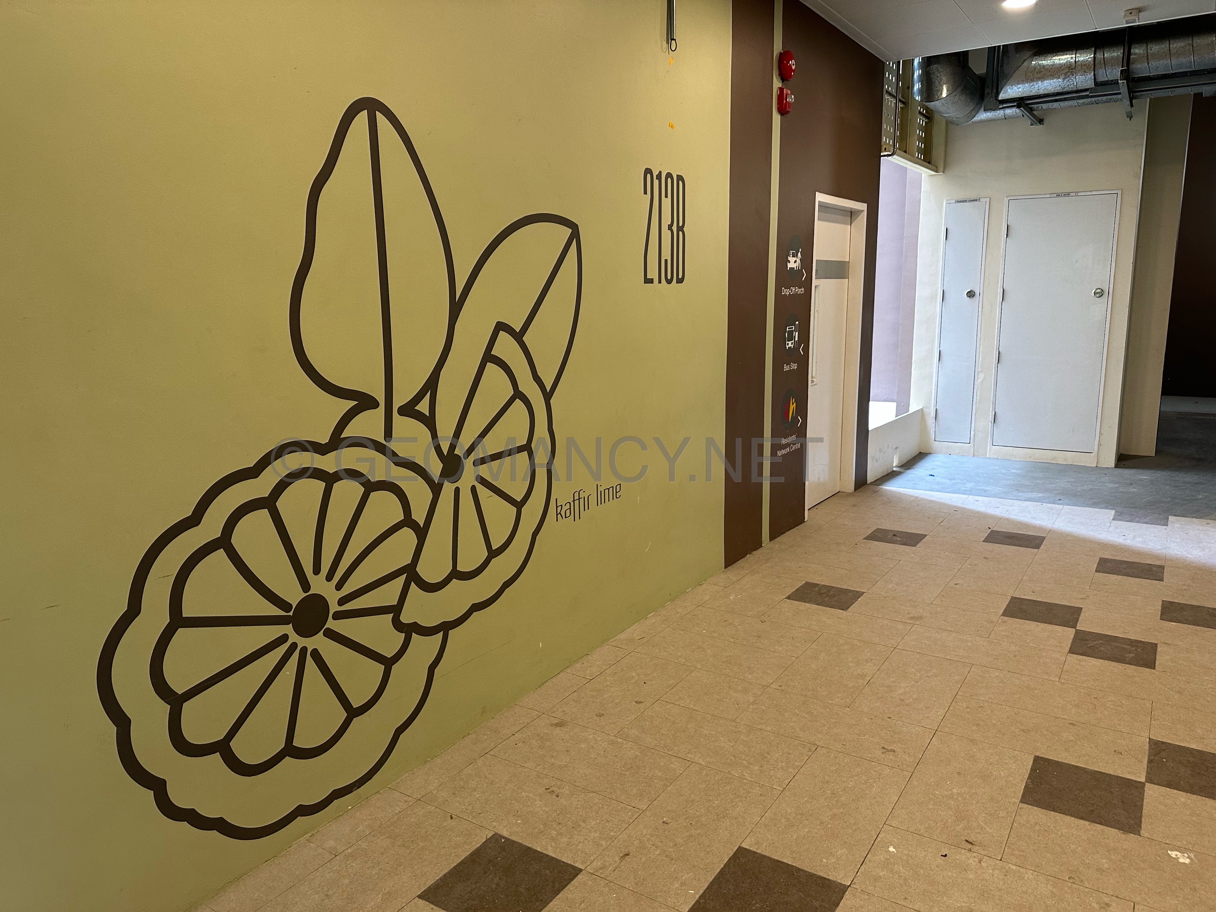
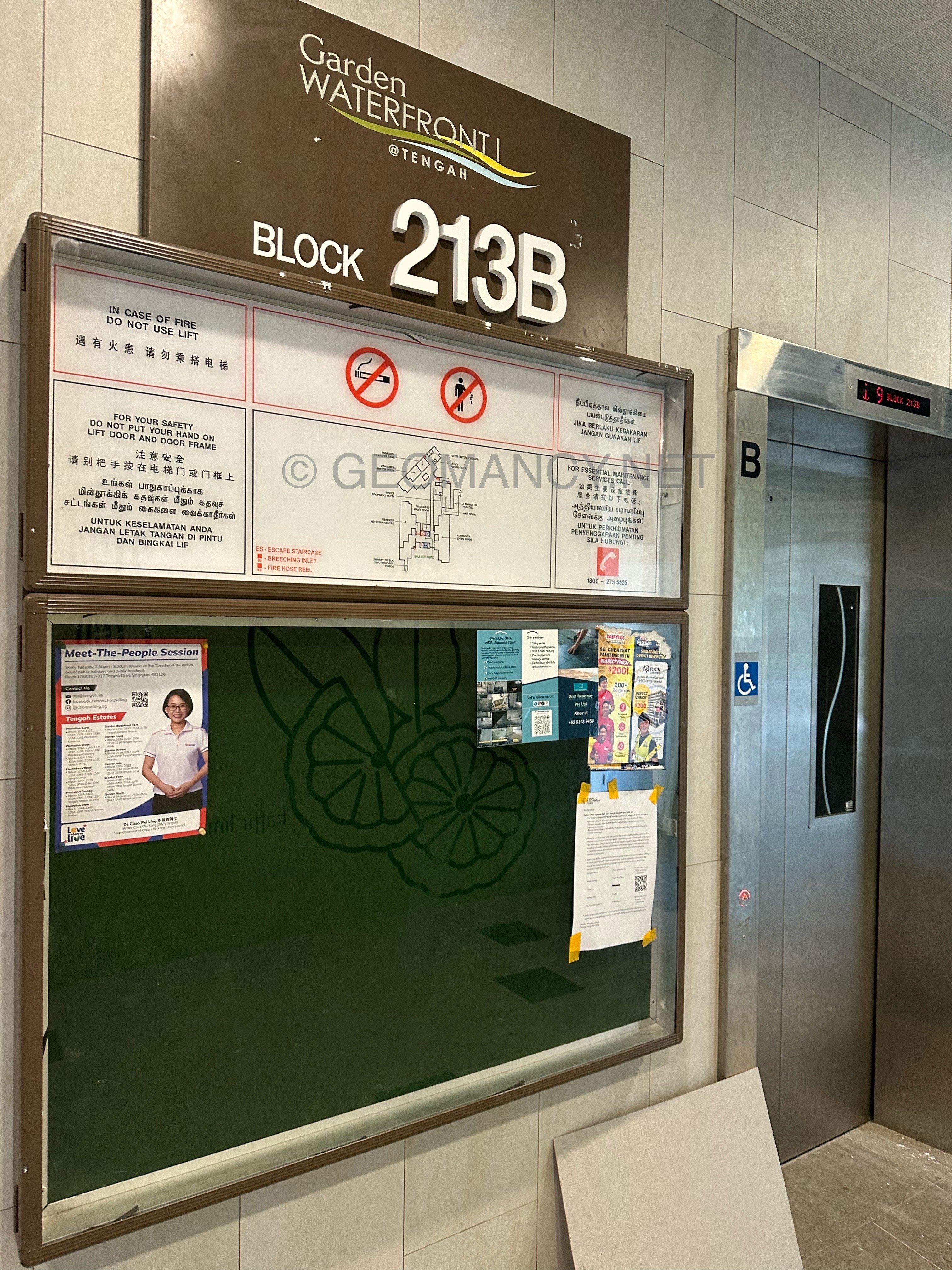
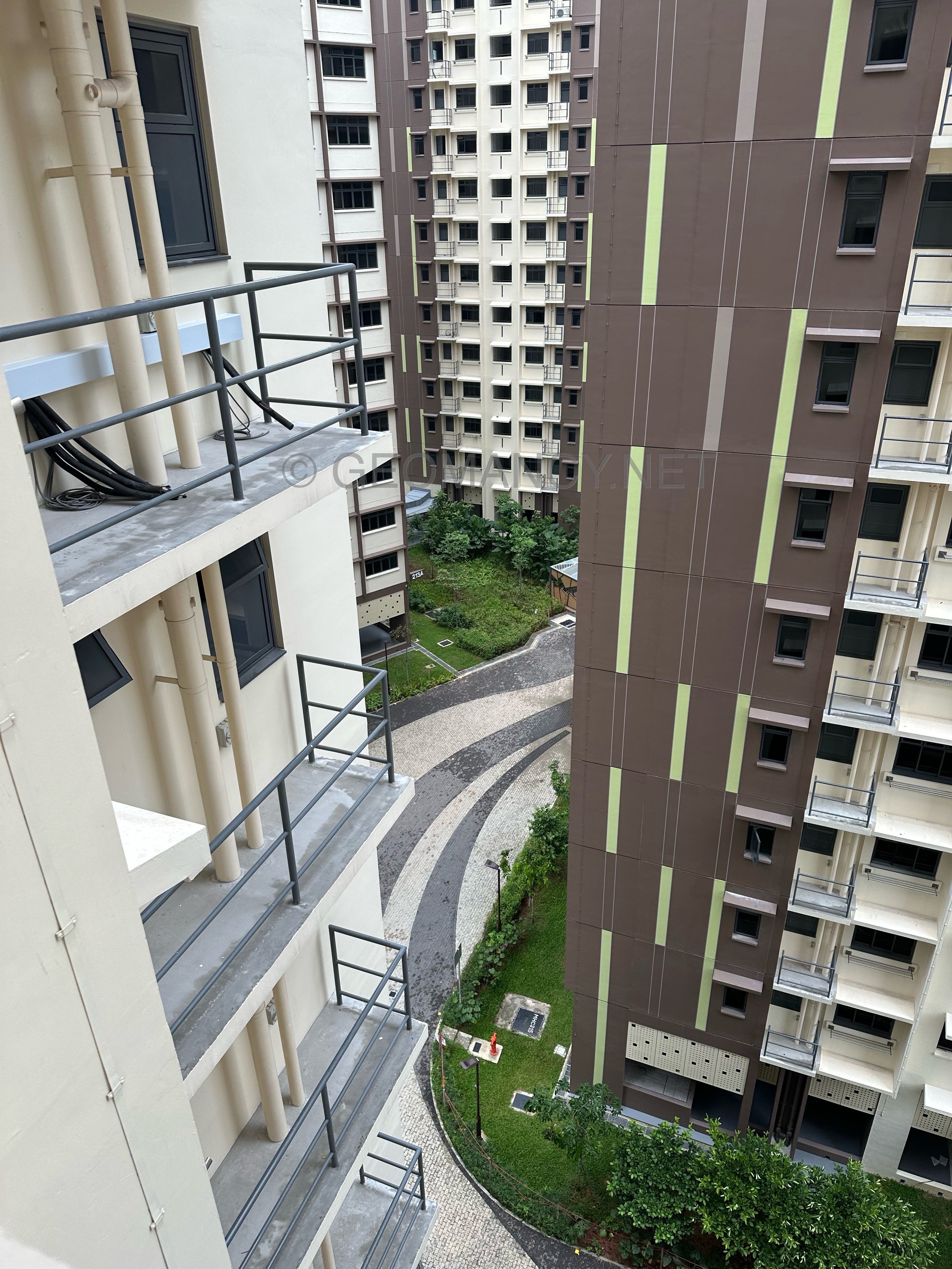
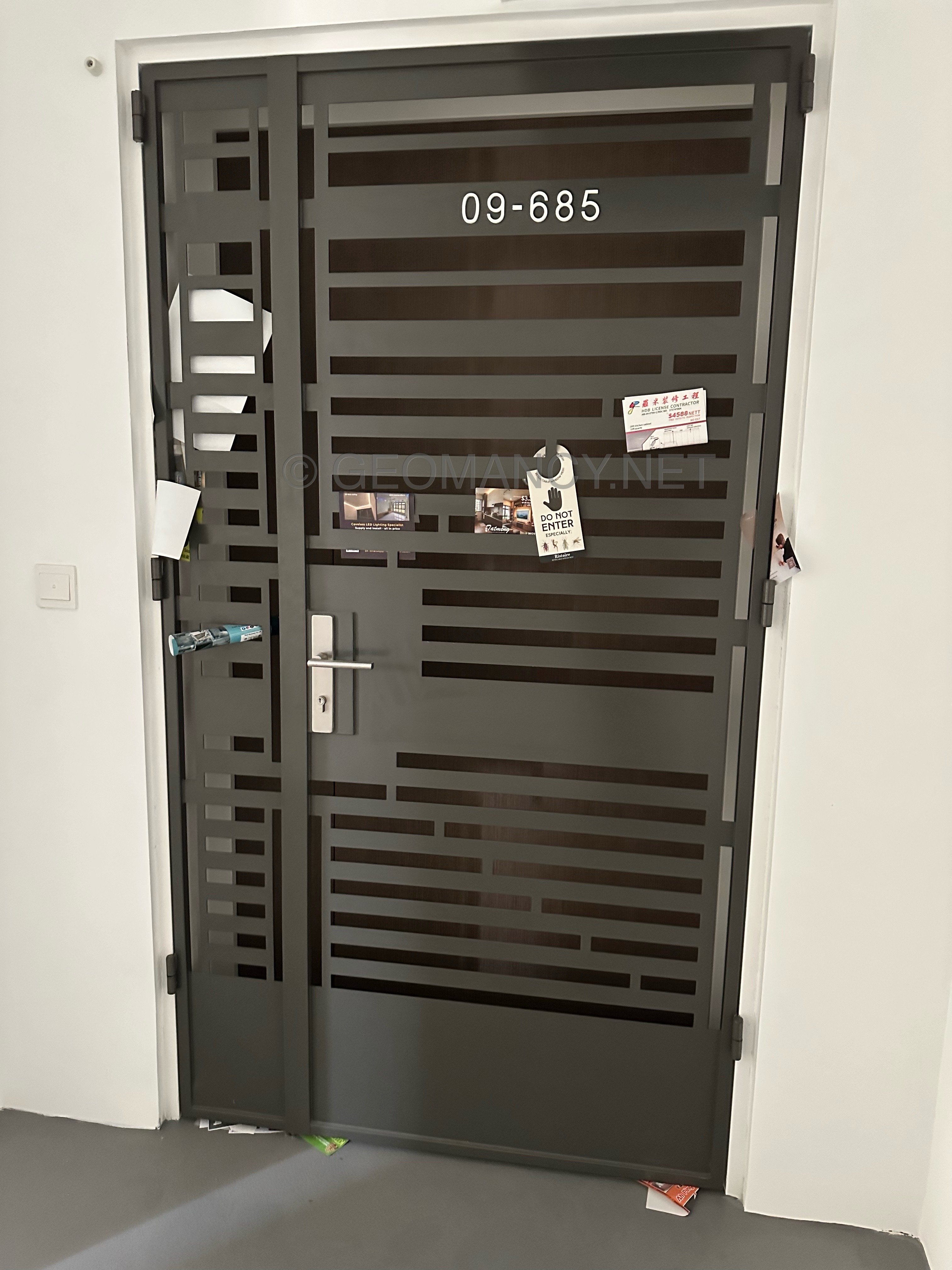
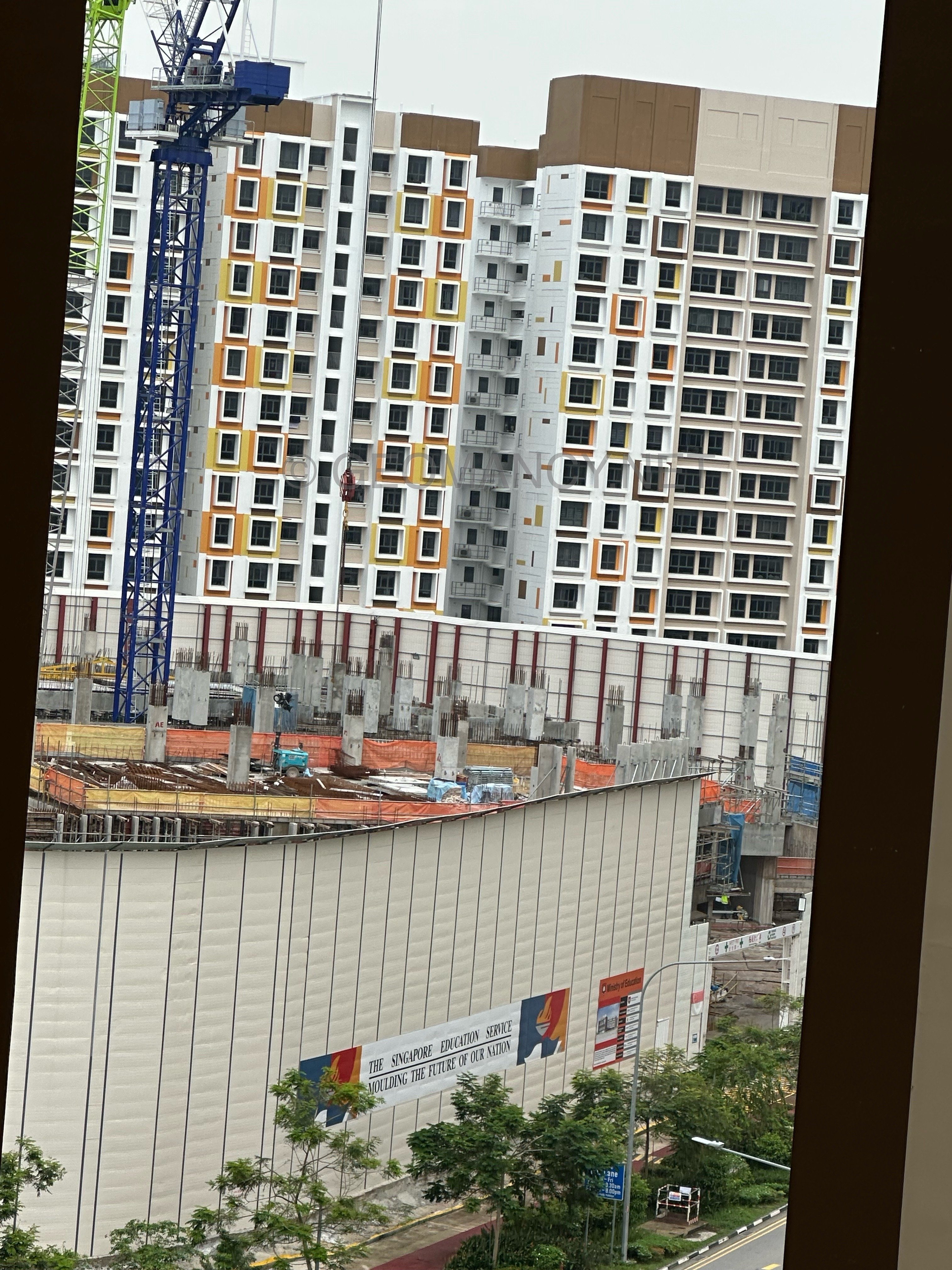
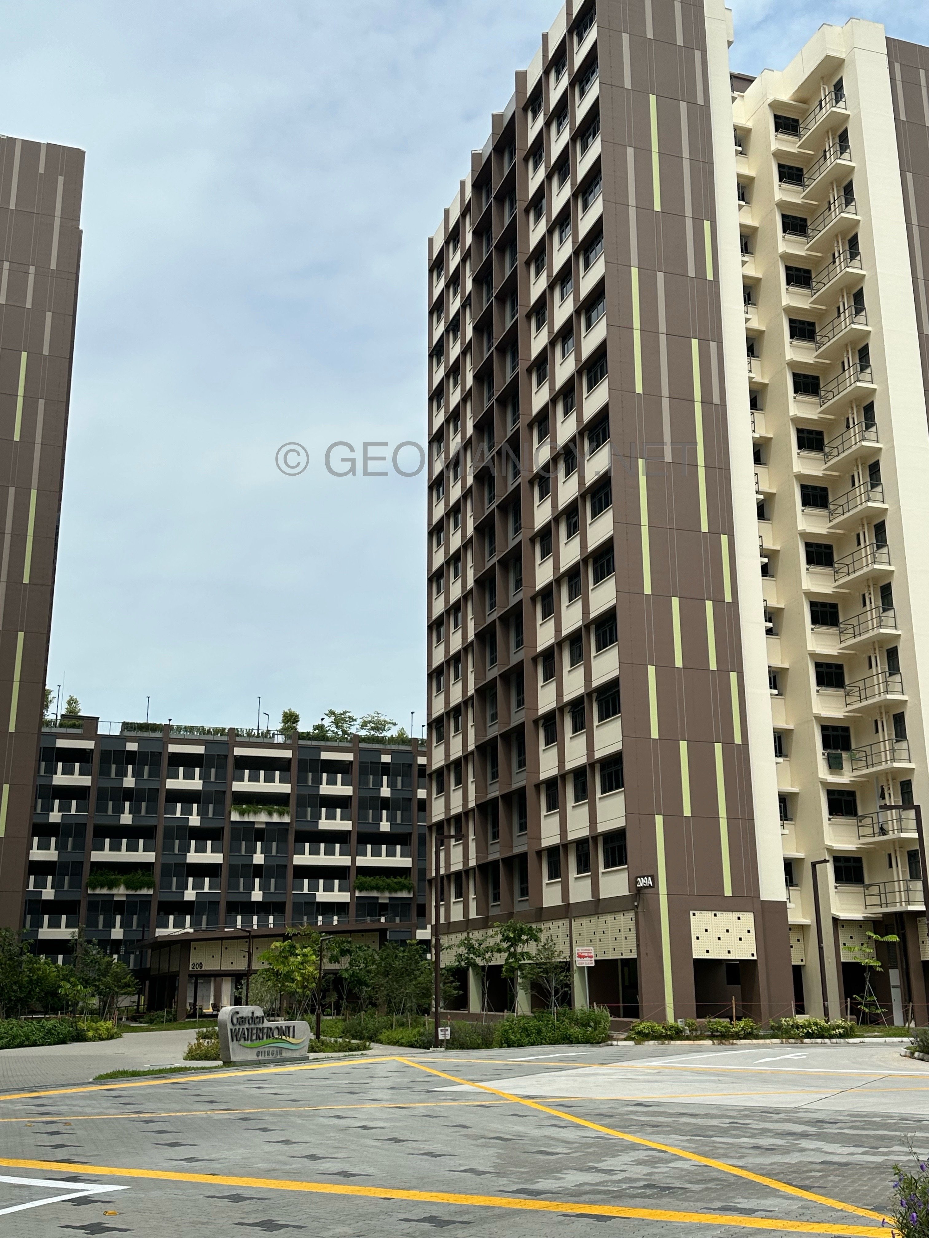
On 26th October 2026, Garden Waterfront I
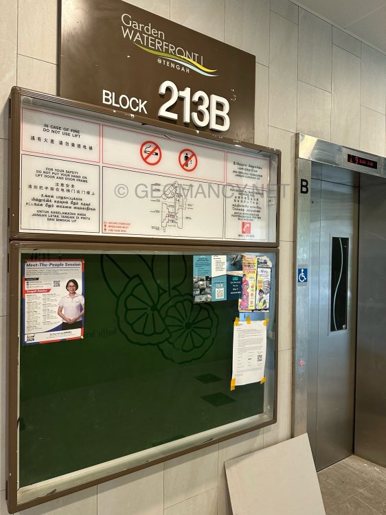
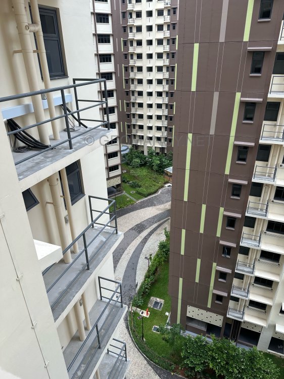
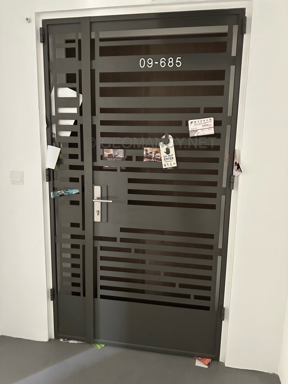
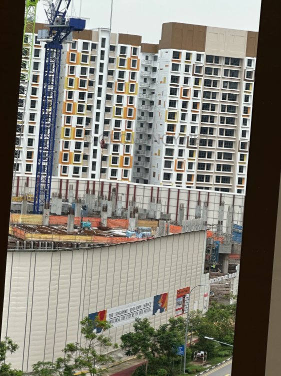

-
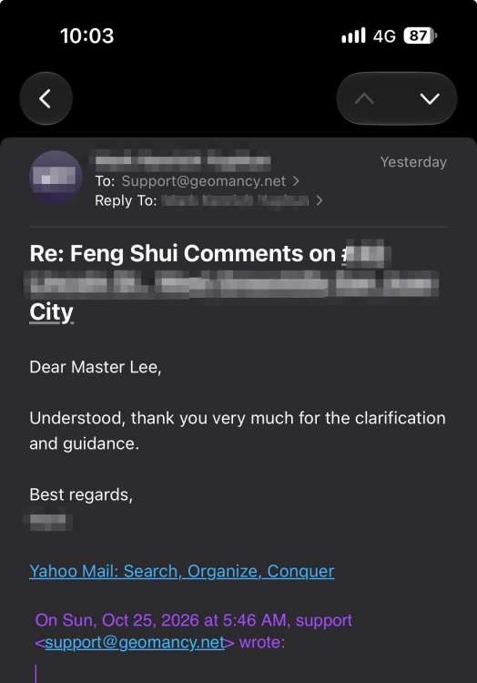
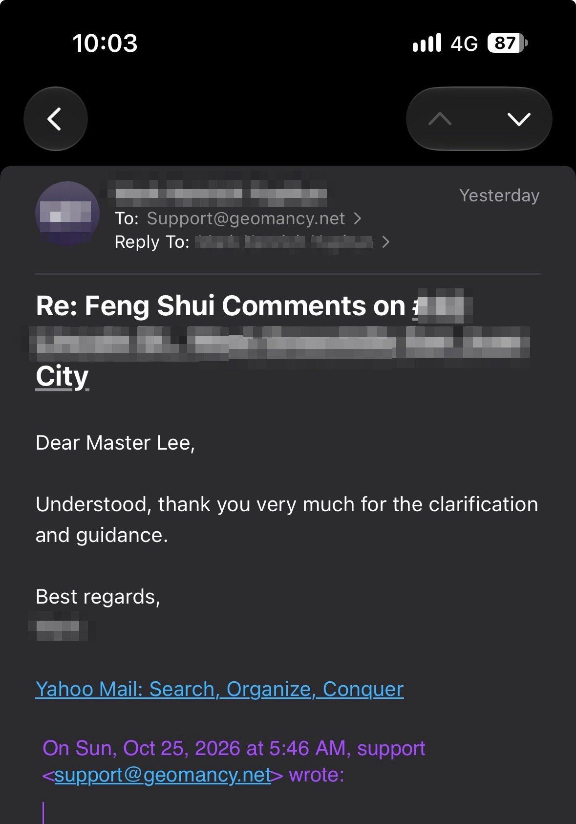
Understood, thank you very much for the clarification and guidance.
-
Not everything revolves solely around the Eight House Theory. That's Why!

-
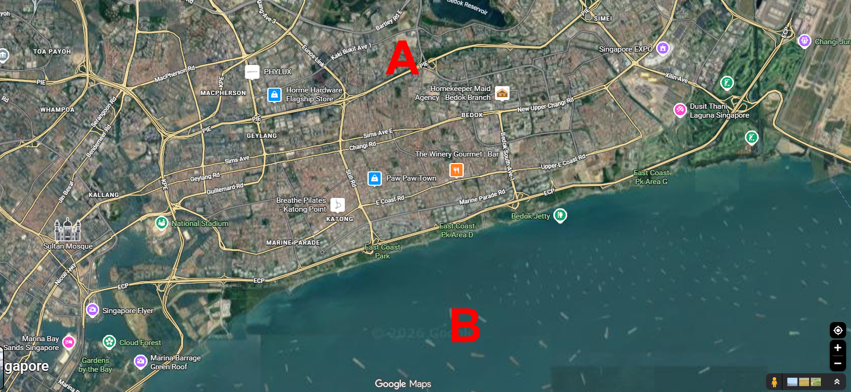
What is Qi? "Unobstructed views, as well as high and low-pressure zones, are the main factors that affect wind conditions. This is based purely on common sense." Cecil Lee, Geomancy.net, 2026
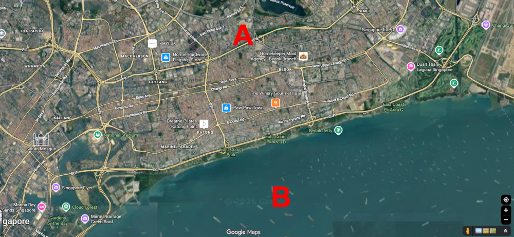
 No two locations are exactly the same. For example, homes close to the sea are more prone to prevailing winds at certain times of the day. Many of us briefly studied the effects of high and low-pressure zones in geography class. As a result, homes near the coast are more readily affected by these changing pressure systems. For instance, on some nights, the area over the sea becomes a low-pressure zone. When this happens, the wind blows from the land in the north toward the sea, and vice versa during the day. Long-time residents on this part of the east coast can often feel the wind shifting north to south as these pressure zones fluctuate. EAST COAST OF SINGAPORE
 With emails, Rare today…
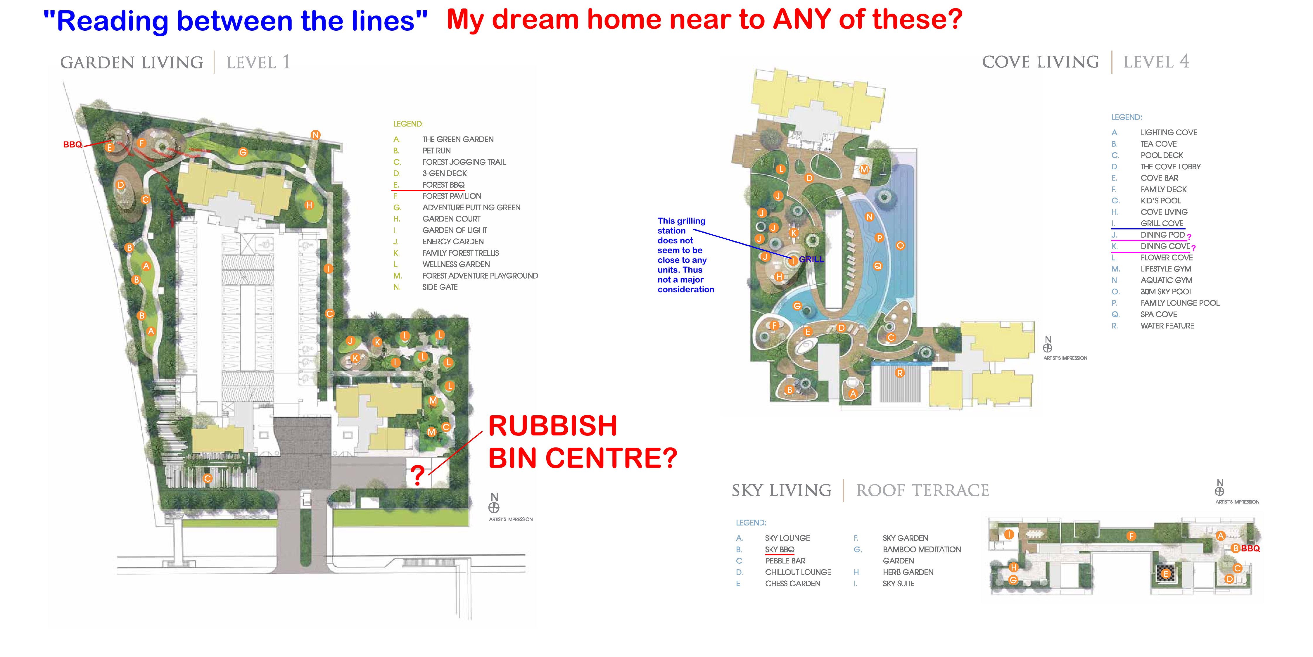
 Is the Sales Brochure Useful? Introduction: For brand new just launched developments, there is no physical site to visit the completed buildings and apartments. 1. The only thing we can do is to visit the show room (which often is close-by to the site) as well as obtain a sales brochure and see the mock-up of the development. As well as try to ask questions from the sales agent (if any). 1.1. We must still try to gather as much information as we can. 2. Summary of Case Studies in this article. If the information is overwhelming. Pick and choose selective articles... 1A & B: Common Rubbish Bin 2A & B: Interior unit Dry Walls 3: Fire at Heaven's Gate 4: Sha Qi or Poison Arrows from Club-house roof-lines 5: 3 Panel Sliding Doors at the Balcony 6: Drainage at the Balcony 7: Air-con Ledges 8: Mixed Developments + Cooling Towers 9: Termite infestations 10: Coffee-shop below or near to unit 11: Water tank at roof-top 12: Lamp Posts, Pillars, Tree Trunks 13: Spice Garden in an EC/condo 14: EC/condo Clubhouse 15A & B: Pneumatic Waste Collection System 16: Look closely at the development's scale model for clues 17: Buying a Mixed development apartment 18: Survey or study facilities surrounding the development 19: Pump Room below a unit 20: Seven Commandments of Stove Placement 21: Is there a potential poison arrow from the neighbours? 22: Should I be concerned with a near-by temple, church, mosque &/or elder care? 23: Is the compass marking on the Sales Brochure accurate? 24: Sites reserved for Schools? 25: Doors face each other? [Main Door/Bedrooms] 26: Unit numbers with 4, 44 or 444 Okay? 27: Stove or sink or WC at the Centre of the house? 3. It is always an excellent idea to spent some time to scrutinise a prospective sales brochure of our potential buy (purchase). 4. Recently, more and more clients have discovered to their shock (horror) that the least expected was the location of the central rubbish bin outside their unit. 5. A year ago; many had purchased a premium unit within the development .. and later shocked to learn that the central rubbish chute (for their entire floor) is just next to their main door! 6. Thus the morale of the story is to check first before signing on the dotted line. 7. In general, most developments have these:- 8.1. A central rubbish collection centre / rubbish bin collection point 8.2. Power Sub-station. Every development usually has one or more of these depending on the size of the development. 8.3. Design of club-house roof-lines / trellis / gazebo / pavilion. Are the designs a "threat" e.g. with spikes or like a razor's edge? Usually these are aimed towards lower storeys. 8.4. Any poison arrows in the form of a sharp corner of another block of neighbouring stack aimed towards one's balcony (hard to cure) or towards one's windows (if any) 8.5. Location of areas like BBQ pits and any impact e.g. the smell from these pits towards a unit.. especially low storeys such as #01 or #02 first or second storeys 8.6. Any tree trunk aimed towards a lower unit e.g. #01 or #02. Unfortunately it may be too late; especially if the development is under construction. 9. There are lots more considerations... 9.1. Do remember "Read in-between" the lines.. CLICK THIS LINK TO LEARN MORE The Experts in House Hunting " As much as we see, Geomancy.net has great web presence built up over the years and is seen as one of the SG market leaders in residential house audit. " Success starts with good Feng Shui Transparent Pricing & No Hidden Costs. No Purchase of Products. Cecil Lee, +65 9785-3171 / support@geomancy.net +++ Type in the unit number to find out OPTION 1 Please go to this link to check a unit number: https://www.geomancy.net/content/personalised-reports/free-feng-shui-reports/house-number-report/about-house-number-report [Need to create a free account to access it] or OPTION 2 Go to URL: https://login.geomancy.net On the blue navigation on the left, click under Free Reports | House Number.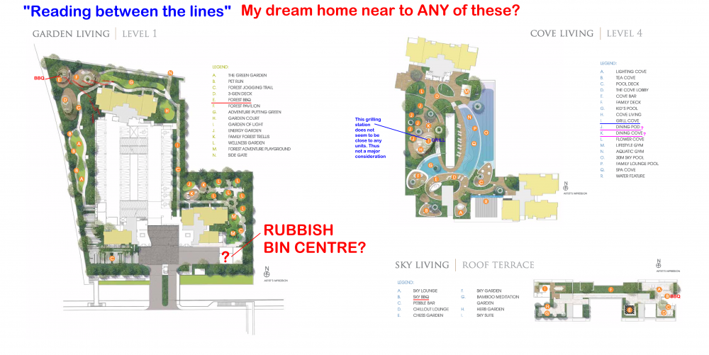




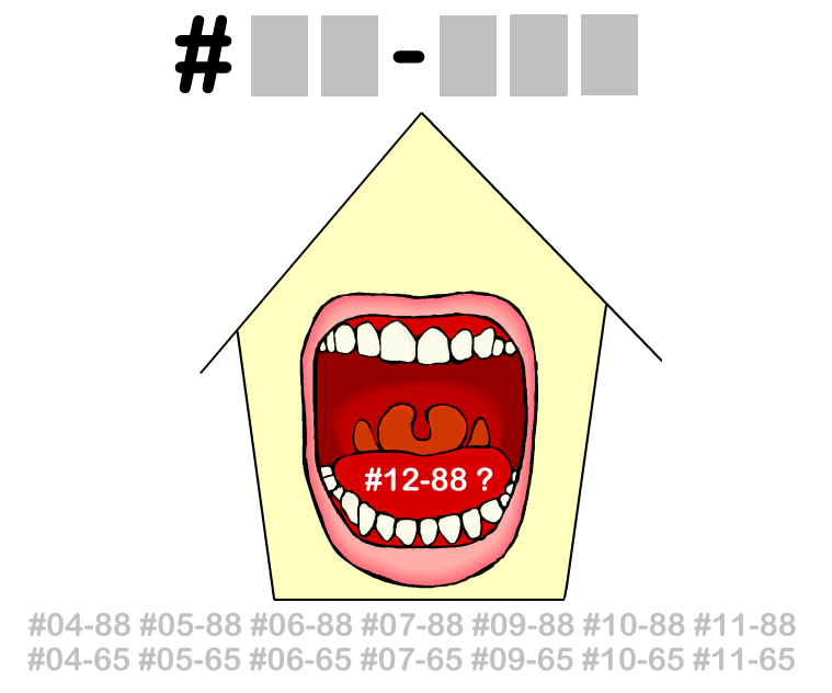

 Is the Sales Brochure Useful? Introduction: For brand new just launched developments, there is no physical site to visit the completed buildings and apartments. 1. The only thing we can do is to visit the show room (which often is close-by to the site) as well as obtain a sales brochure and see the mock-up of the development. As well as try to ask questions from the sales agent (if any). 1.1. We must still try to gather as much information as we can. 2. Summary of Case Studies in this article. If the information is overwhelming. Pick and choose selective articles... 1A & B: Common Rubbish Bin 2A & B: Interior unit Dry Walls 3: Fire at Heaven's Gate 4: Sha Qi or Poison Arrows from Club-house roof-lines 5: 3 Panel Sliding Doors at the Balcony 6: Drainage at the Balcony 7: Air-con Ledges 8: Mixed Developments + Cooling Towers 9: Termite infestations 10: Coffee-shop below or near to unit 11: Water tank at roof-top 12: Lamp Posts, Pillars, Tree Trunks 13: Spice Garden in an EC/condo 14: EC/condo Clubhouse 15A & B: Pneumatic Waste Collection System 16: Look closely at the development's scale model for clues 17: Buying a Mixed development apartment 18: Survey or study facilities surrounding the development 19: Pump Room below a unit 20: Seven Commandments of Stove Placement 21: Is there a potential poison arrow from the neighbours? 22: Should I be concerned with a near-by temple, church, mosque &/or elder care? 23: Is the compass marking on the Sales Brochure accurate? 24: Sites reserved for Schools? 25: Doors face each other? [Main Door/Bedrooms] 26: Unit numbers with 4, 44 or 444 Okay? 27: Stove or sink or WC at the Centre of the house? 3. It is always an excellent idea to spent some time to scrutinise a prospective sales brochure of our potential buy (purchase). 4. Recently, more and more clients have discovered to their shock (horror) that the least expected was the location of the central rubbish bin outside their unit. 5. A year ago; many had purchased a premium unit within the development .. and later shocked to learn that the central rubbish chute (for their entire floor) is just next to their main door! 6. Thus the morale of the story is to check first before signing on the dotted line. 7. In general, most developments have these:- 8.1. A central rubbish collection centre / rubbish bin collection point 8.2. Power Sub-station. Every development usually has one or more of these depending on the size of the development. 8.3. Design of club-house roof-lines / trellis / gazebo / pavilion. Are the designs a "threat" e.g. with spikes or like a razor's edge? Usually these are aimed towards lower storeys. 8.4. Any poison arrows in the form of a sharp corner of another block of neighbouring stack aimed towards one's balcony (hard to cure) or towards one's windows (if any) 8.5. Location of areas like BBQ pits and any impact e.g. the smell from these pits towards a unit.. especially low storeys such as #01 or #02 first or second storeys 8.6. Any tree trunk aimed towards a lower unit e.g. #01 or #02. Unfortunately it may be too late; especially if the development is under construction. 9. There are lots more considerations... 9.1. Do remember "Read in-between" the lines.. CLICK THIS LINK TO LEARN MORE The Experts in House Hunting " As much as we see, Geomancy.net has great web presence built up over the years and is seen as one of the SG market leaders in residential house audit. " Success starts with good Feng Shui Transparent Pricing & No Hidden Costs. No Purchase of Products. Cecil Lee, +65 9785-3171 / support@geomancy.net +++ Type in the unit number to find out OPTION 1 Please go to this link to check a unit number: https://www.geomancy.net/content/personalised-reports/free-feng-shui-reports/house-number-report/about-house-number-report [Need to create a free account to access it] or OPTION 2 Go to URL: https://login.geomancy.net On the blue navigation on the left, click under Free Reports | House Number.
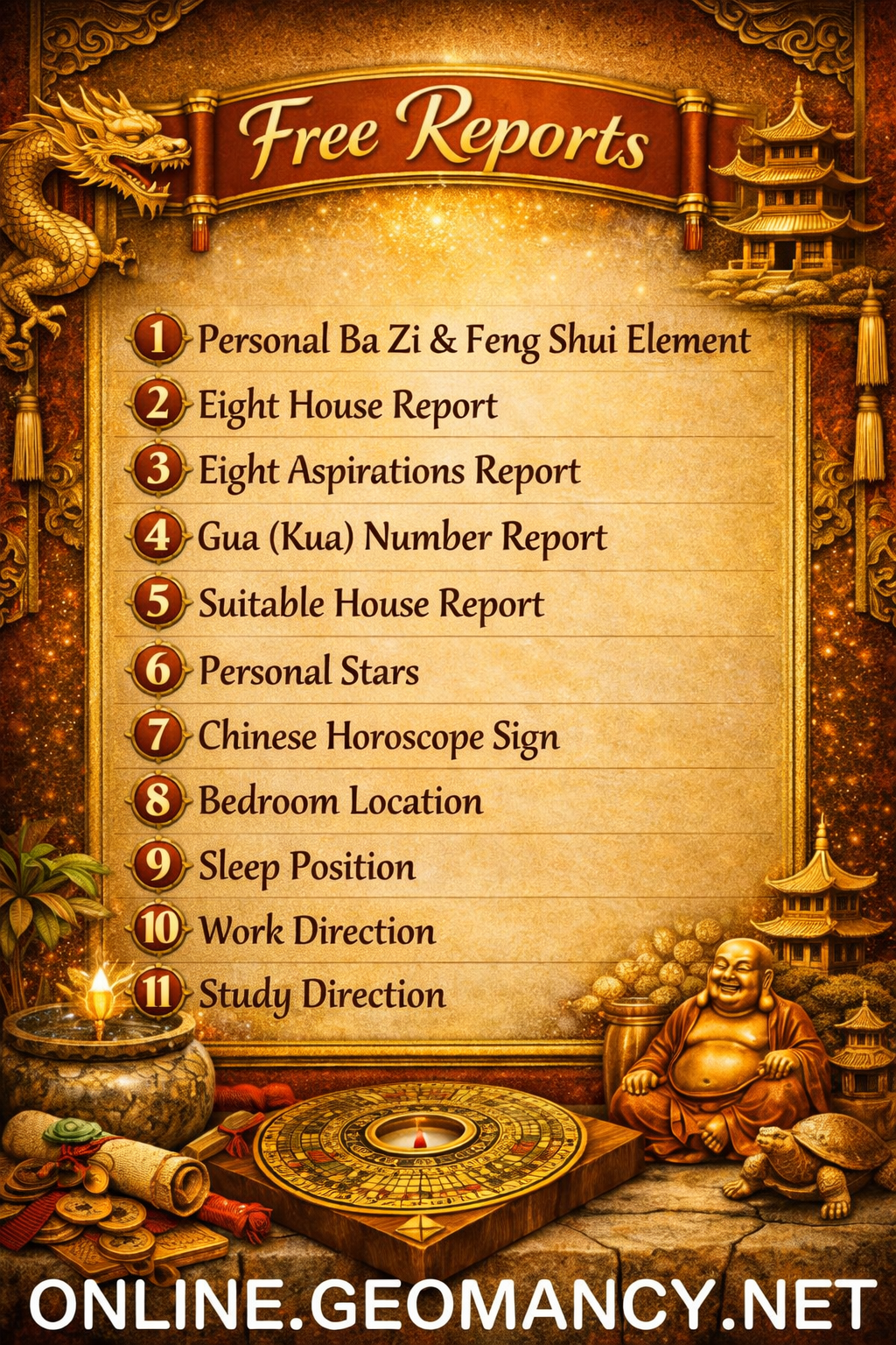
Free Personalised Analysis Reports Personalised Reports Free Analysis Reports Find out your Life Association Sectors Find out your Gua (Kua) Number? East or West Group Person? Find out your Horoscope? Find out your Characteristics? Find out your Personal Element? How suitable is your Home? Your Favourable Sleep Position? Your Favourable Study Position? Your Favourable Work Position? Your Favourable Bedroom Location? Is your Apartment Number Auspicious? Generate Free Reports Generate 4 Good & 4 Bad Direction Report Generate Ba Zi Luck Analysis, Personal Element & Horoscope Insights- (FREEBAZI.GEOMANCY.NET) Generate 30 Days Auspicious Date for ONE or TWO Persons(DATE.GEOMANCY.NET) More FREE Reports Welcome to Personalized Analysis ReportsSince 1996, Geomancy.net has guided individuals in understanding Feng Shui and Chinese divination. With our expertise, we have assisted thousands, becoming a trusted resource for those seeking knowledge. Our personalized analysis reports empower you to tap into these ancient practices, significantly improving your quality of life. Discover the Power of Personalized Analysis ReportsAt ONLINE.GEOMANCY.NET, we provide free personalized analysis reports that empower you to understand the intricate connections between your living environment and your personal well-being. By leveraging time-honored techniques from Feng Shui and Chinese divination, our reports help you uncover valuable insights that can guide your decisions and improve your lifestyle. What We OfferOur comprehensive reports are designed to give you a holistic view of your life associations and environmental influences. Here’s what you can expect from our personalized analysis: Life Association SectorsUnderstanding your life association sectors is crucial for achieving balance and harmony. Our reports will reveal the areas of your life that are most influenced by your environment, helping you to focus your energy where it matters most. Your Gua (Kua) NumberYour Gua number is a vital aspect of Feng Shui that determines your personal energy profile. By calculating your Gua number, you can gain insights into your strengths and weaknesses, allowing you to make informed decisions that align with your true nature. East or West Group Person?Identifying whether you belong to the East or West group can significantly impact your approach to life. Our analysis will classify you accordingly, providing tailored recommendations for your personal growth and development. Horoscope InsightsAstrology plays a significant role in understanding your personality traits and life path. Our reports will include your horoscope, offering insights into your character and potential challenges you may face. Understanding Your CharacteristicsEvery individual has unique characteristics shaped by various factors. Our personalized reports will analyze these traits, helping you to understand how they influence your interactions and relationships. Your Personal ElementIn Feng Shui, the five elements (Wood, Fire, Earth, Metal, Water) play a crucial role in shaping your life. Our analysis will determine your personal element, providing insights that can help you harmonize with your environment. Assessing Your Home's SuitabilityYour living space significantly affects your overall well-being. Our reports will evaluate how suitable your home is for you, considering factors such as layout, direction, and energy flow. This assessment can guide you in making necessary adjustments to enhance your living environment. Favorable Sleep PositionDid you know that your sleep position can impact your health? Our analysis will suggest the best sleep position for you based on your personal energy profile, helping you achieve better rest and rejuvenation. Optimal Study PositionFor students and professionals alike, the right study position can enhance focus and productivity. Our reports will provide recommendations for your ideal study position, allowing you to maximize your learning potential. Favorable Work PositionYour work environment plays a critical role in your success. We will analyze your work position to ensure it aligns with your personal energy, promoting productivity and satisfaction in your professional life. Bedroom LocationThe location of your bedroom can influence your relationships and personal energy. Our reports will offer insights into the most beneficial bedroom location for you, fostering a peaceful and harmonious space. Auspicious Apartment NumbersDid you know that the number of your apartment can carry significant meaning? Our analysis will determine whether your apartment number is auspicious, guiding you towards a more favorable living situation. Generate Your Free ReportsReady to take the next step? Generating your free personalized analysis reports is simple: Login or Sign Up: Access your account at ONLINE.GEOMANCY.NET to get started. Choose Your Reports: Select from various reports, including: 4 Good & 4 Bad Direction Report Ba Zi Luck Analysis Personal Element Insights Horoscope Insights Receive Your Analysis: Once generated, your reports will be available for you to explore.
Is the Sales Brochure Useful? Introduction: For brand new just launched developments, there is no physical site to visit the completed buildings and apartments. 1. The only thing we can do is to visit the show room (which often is close-by to the site) as well as obtain a sales brochure and see the mock-up of the development. As well as try to ask questions from the sales agent (if any). 1.1. We must still try to gather as much information as we can. 2. Summary of Case Studies in this article. If the information is overwhelming. Pick and choose selective articles... 1A & B: Common Rubbish Bin 2A & B: Interior unit Dry Walls 3: Fire at Heaven's Gate 4: Sha Qi or Poison Arrows from Club-house roof-lines 5: 3 Panel Sliding Doors at the Balcony 6: Drainage at the Balcony 7: Air-con Ledges 8: Mixed Developments + Cooling Towers 9: Termite infestations 10: Coffee-shop below or near to unit 11: Water tank at roof-top 12: Lamp Posts, Pillars, Tree Trunks 13: Spice Garden in an EC/condo 14: EC/condo Clubhouse 15A & B: Pneumatic Waste Collection System 16: Look closely at the development's scale model for clues 17: Buying a Mixed development apartment 18: Survey or study facilities surrounding the development 19: Pump Room below a unit 20: Seven Commandments of Stove Placement 21: Is there a potential poison arrow from the neighbours? 22: Should I be concerned with a near-by temple, church, mosque &/or elder care? 23: Is the compass marking on the Sales Brochure accurate? 24: Sites reserved for Schools? 25: Doors face each other? [Main Door/Bedrooms] 26: Unit numbers with 4, 44 or 444 Okay? 27: Stove or sink or WC at the Centre of the house? 3. It is always an excellent idea to spent some time to scrutinise a prospective sales brochure of our potential buy (purchase). 4. Recently, more and more clients have discovered to their shock (horror) that the least expected was the location of the central rubbish bin outside their unit. 5. A year ago; many had purchased a premium unit within the development .. and later shocked to learn that the central rubbish chute (for their entire floor) is just next to their main door! 6. Thus the morale of the story is to check first before signing on the dotted line. 7. In general, most developments have these:- 8.1. A central rubbish collection centre / rubbish bin collection point 8.2. Power Sub-station. Every development usually has one or more of these depending on the size of the development. 8.3. Design of club-house roof-lines / trellis / gazebo / pavilion. Are the designs a "threat" e.g. with spikes or like a razor's edge? Usually these are aimed towards lower storeys. 8.4. Any poison arrows in the form of a sharp corner of another block of neighbouring stack aimed towards one's balcony (hard to cure) or towards one's windows (if any) 8.5. Location of areas like BBQ pits and any impact e.g. the smell from these pits towards a unit.. especially low storeys such as #01 or #02 first or second storeys 8.6. Any tree trunk aimed towards a lower unit e.g. #01 or #02. Unfortunately it may be too late; especially if the development is under construction. 9. There are lots more considerations... 9.1. Do remember "Read in-between" the lines.. CLICK THIS LINK TO LEARN MORE The Experts in House Hunting " As much as we see, Geomancy.net has great web presence built up over the years and is seen as one of the SG market leaders in residential house audit. " Success starts with good Feng Shui Transparent Pricing & No Hidden Costs. No Purchase of Products. Cecil Lee, +65 9785-3171 / support@geomancy.net +++ Type in the unit number to find out OPTION 1 Please go to this link to check a unit number: https://www.geomancy.net/content/personalised-reports/free-feng-shui-reports/house-number-report/about-house-number-report [Need to create a free account to access it] or OPTION 2 Go to URL: https://login.geomancy.net On the blue navigation on the left, click under Free Reports | House Number.
Free Personalised Analysis Reports Personalised Reports Free Analysis Reports Find out your Life Association Sectors Find out your Gua (Kua) Number? East or West Group Person? Find out your Horoscope? Find out your Characteristics? Find out your Personal Element? How suitable is your Home? Your Favourable Sleep Position? Your Favourable Study Position? Your Favourable Work Position? Your Favourable Bedroom Location? Is your Apartment Number Auspicious? Generate Free Reports Generate 4 Good & 4 Bad Direction Report Generate Ba Zi Luck Analysis, Personal Element & Horoscope Insights- (FREEBAZI.GEOMANCY.NET) Generate 30 Days Auspicious Date for ONE or TWO Persons(DATE.GEOMANCY.NET) More FREE Reports Welcome to Personalized Analysis ReportsSince 1996, Geomancy.net has guided individuals in understanding Feng Shui and Chinese divination. With our expertise, we have assisted thousands, becoming a trusted resource for those seeking knowledge. Our personalized analysis reports empower you to tap into these ancient practices, significantly improving your quality of life. Discover the Power of Personalized Analysis ReportsAt ONLINE.GEOMANCY.NET, we provide free personalized analysis reports that empower you to understand the intricate connections between your living environment and your personal well-being. By leveraging time-honored techniques from Feng Shui and Chinese divination, our reports help you uncover valuable insights that can guide your decisions and improve your lifestyle. What We OfferOur comprehensive reports are designed to give you a holistic view of your life associations and environmental influences. Here’s what you can expect from our personalized analysis: Life Association SectorsUnderstanding your life association sectors is crucial for achieving balance and harmony. Our reports will reveal the areas of your life that are most influenced by your environment, helping you to focus your energy where it matters most. Your Gua (Kua) NumberYour Gua number is a vital aspect of Feng Shui that determines your personal energy profile. By calculating your Gua number, you can gain insights into your strengths and weaknesses, allowing you to make informed decisions that align with your true nature. East or West Group Person?Identifying whether you belong to the East or West group can significantly impact your approach to life. Our analysis will classify you accordingly, providing tailored recommendations for your personal growth and development. Horoscope InsightsAstrology plays a significant role in understanding your personality traits and life path. Our reports will include your horoscope, offering insights into your character and potential challenges you may face. Understanding Your CharacteristicsEvery individual has unique characteristics shaped by various factors. Our personalized reports will analyze these traits, helping you to understand how they influence your interactions and relationships. Your Personal ElementIn Feng Shui, the five elements (Wood, Fire, Earth, Metal, Water) play a crucial role in shaping your life. Our analysis will determine your personal element, providing insights that can help you harmonize with your environment. Assessing Your Home's SuitabilityYour living space significantly affects your overall well-being. Our reports will evaluate how suitable your home is for you, considering factors such as layout, direction, and energy flow. This assessment can guide you in making necessary adjustments to enhance your living environment. Favorable Sleep PositionDid you know that your sleep position can impact your health? Our analysis will suggest the best sleep position for you based on your personal energy profile, helping you achieve better rest and rejuvenation. Optimal Study PositionFor students and professionals alike, the right study position can enhance focus and productivity. Our reports will provide recommendations for your ideal study position, allowing you to maximize your learning potential. Favorable Work PositionYour work environment plays a critical role in your success. We will analyze your work position to ensure it aligns with your personal energy, promoting productivity and satisfaction in your professional life. Bedroom LocationThe location of your bedroom can influence your relationships and personal energy. Our reports will offer insights into the most beneficial bedroom location for you, fostering a peaceful and harmonious space. Auspicious Apartment NumbersDid you know that the number of your apartment can carry significant meaning? Our analysis will determine whether your apartment number is auspicious, guiding you towards a more favorable living situation. Generate Your Free ReportsReady to take the next step? Generating your free personalized analysis reports is simple: Login or Sign Up: Access your account at ONLINE.GEOMANCY.NET to get started. Choose Your Reports: Select from various reports, including: 4 Good & 4 Bad Direction Report Ba Zi Luck Analysis Personal Element Insights Horoscope Insights Receive Your Analysis: Once generated, your reports will be available for you to explore.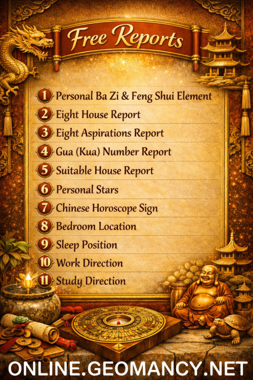 Free Personalised Analysis Reports Personalised Reports Free Analysis Reports Find out your Life Association Sectors Find out your Gua (Kua) Number? East or West Group Person? Find out your Horoscope? Find out your Characteristics? Find out your Personal Element? How suitable is your Home? Your Favourable Sleep Position? Your Favourable Study Position? Your Favourable Work Position? Your Favourable Bedroom Location? Is your Apartment Number Auspicious? Generate Free Reports Generate 4 Good & 4 Bad Direction Report Generate Ba Zi Luck Analysis, Personal Element & Horoscope Insights- (FREEBAZI.GEOMANCY.NET) Generate 30 Days Auspicious Date for ONE or TWO Persons(DATE.GEOMANCY.NET) More FREE Reports Welcome to Personalized Analysis ReportsSince 1996, Geomancy.net has guided individuals in understanding Feng Shui and Chinese divination. With our expertise, we have assisted thousands, becoming a trusted resource for those seeking knowledge. Our personalized analysis reports empower you to tap into these ancient practices, significantly improving your quality of life. Discover the Power of Personalized Analysis ReportsAt ONLINE.GEOMANCY.NET, we provide free personalized analysis reports that empower you to understand the intricate connections between your living environment and your personal well-being. By leveraging time-honored techniques from Feng Shui and Chinese divination, our reports help you uncover valuable insights that can guide your decisions and improve your lifestyle. What We OfferOur comprehensive reports are designed to give you a holistic view of your life associations and environmental influences. Here’s what you can expect from our personalized analysis: Life Association SectorsUnderstanding your life association sectors is crucial for achieving balance and harmony. Our reports will reveal the areas of your life that are most influenced by your environment, helping you to focus your energy where it matters most. Your Gua (Kua) NumberYour Gua number is a vital aspect of Feng Shui that determines your personal energy profile. By calculating your Gua number, you can gain insights into your strengths and weaknesses, allowing you to make informed decisions that align with your true nature. East or West Group Person?Identifying whether you belong to the East or West group can significantly impact your approach to life. Our analysis will classify you accordingly, providing tailored recommendations for your personal growth and development. Horoscope InsightsAstrology plays a significant role in understanding your personality traits and life path. Our reports will include your horoscope, offering insights into your character and potential challenges you may face. Understanding Your CharacteristicsEvery individual has unique characteristics shaped by various factors. Our personalized reports will analyze these traits, helping you to understand how they influence your interactions and relationships. Your Personal ElementIn Feng Shui, the five elements (Wood, Fire, Earth, Metal, Water) play a crucial role in shaping your life. Our analysis will determine your personal element, providing insights that can help you harmonize with your environment. Assessing Your Home's SuitabilityYour living space significantly affects your overall well-being. Our reports will evaluate how suitable your home is for you, considering factors such as layout, direction, and energy flow. This assessment can guide you in making necessary adjustments to enhance your living environment. Favorable Sleep PositionDid you know that your sleep position can impact your health? Our analysis will suggest the best sleep position for you based on your personal energy profile, helping you achieve better rest and rejuvenation. Optimal Study PositionFor students and professionals alike, the right study position can enhance focus and productivity. Our reports will provide recommendations for your ideal study position, allowing you to maximize your learning potential. Favorable Work PositionYour work environment plays a critical role in your success. We will analyze your work position to ensure it aligns with your personal energy, promoting productivity and satisfaction in your professional life. Bedroom LocationThe location of your bedroom can influence your relationships and personal energy. Our reports will offer insights into the most beneficial bedroom location for you, fostering a peaceful and harmonious space. Auspicious Apartment NumbersDid you know that the number of your apartment can carry significant meaning? Our analysis will determine whether your apartment number is auspicious, guiding you towards a more favorable living situation. Generate Your Free ReportsReady to take the next step? Generating your free personalized analysis reports is simple: Login or Sign Up: Access your account at ONLINE.GEOMANCY.NET to get started. Choose Your Reports: Select from various reports, including: 4 Good & 4 Bad Direction Report Ba Zi Luck Analysis Personal Element Insights Horoscope Insights Receive Your Analysis: Once generated, your reports will be available for you to explore.







Account
Navigation
Search
Configure browser push notifications
Chrome (Android)
- Tap the lock icon next to the address bar.
- Tap Permissions → Notifications.
- Adjust your preference.
Chrome (Desktop)
- Click the padlock icon in the address bar.
- Select Site settings.
- Find Notifications and adjust your preference.
Safari (iOS 16.4+)
- Ensure the site is installed via Add to Home Screen.
- Open Settings App → Notifications.
- Find your app name and adjust your preference.
Safari (macOS)
- Go to Safari → Preferences.
- Click the Websites tab.
- Select Notifications in the sidebar.
- Find this website and adjust your preference.
Edge (Android)
- Tap the lock icon next to the address bar.
- Tap Permissions.
- Find Notifications and adjust your preference.
Edge (Desktop)
- Click the padlock icon in the address bar.
- Click Permissions for this site.
- Find Notifications and adjust your preference.
Firefox (Android)
- Go to Settings → Site permissions.
- Tap Notifications.
- Find this site in the list and adjust your preference.
Firefox (Desktop)
- Open Firefox Settings.
- Search for Notifications.
- Find this site in the list and adjust your preference.