


Cecil Lee
Staff
-
Joined
-
Last visited
Everything posted by Cecil Lee
-
Source and Credit: The image is a screenshot of a Facebook post. It features a photo of a young, blonde woman in a pink crop top and beige pants holding a pink shopping basket in a supermarket. The text overlay on the image reads: "A SUPERMARKET IN FINLAND INTRODUCED PINK BASKETS TO INDICATE THAT A PERSON IS SINGLE AND OPEN TO MEETING SOMEONE".

-
Source and Credit:

-
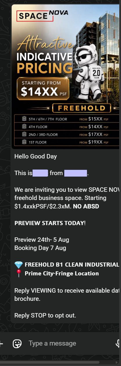
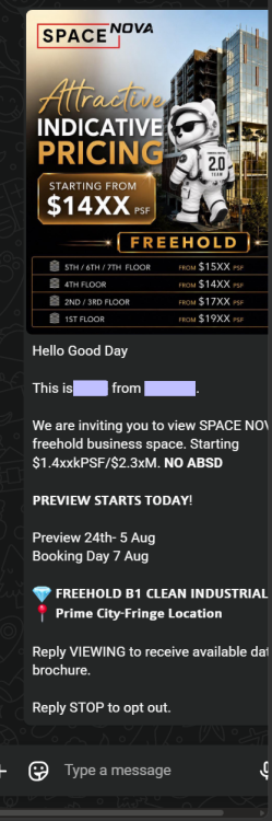
We are inviting you to view SPACE NOVA, a freehold business space. Starting $1.4xxkPSF/$2.3xM. NO ABSD 𝗣𝗥𝗘𝗩𝗜𝗘𝗪 𝗦𝗧𝗔𝗥𝗧𝗦 𝗧𝗢𝗗𝗔𝗬! Preview 24th- 5 Aug Booking Day 7 Aug 💎 𝗙𝗥𝗘𝗘𝗛𝗢𝗟𝗗 𝗕𝟭 𝗖𝗟𝗘𝗔𝗡 𝗜𝗡𝗗𝗨𝗦𝗧𝗥𝗜𝗔𝗟 📍 𝗣𝗿𝗶𝗺𝗲 𝗖𝗶𝘁𝘆-𝗙𝗿𝗶𝗻𝗴𝗲 𝗟𝗼𝗰𝗮𝘁𝗶𝗼𝗻
-
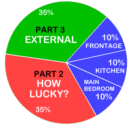
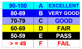
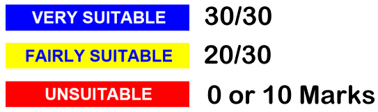
Toilet in middle of unit? Feng Shui (FS) is not so fragile The ABC's of Feng Shui... 1. That one issue e.g. such as a toilet at the centrepoint is considered a death sentence or fatal error on it's own. 2. There are often more than one issue that can bring the Feng Shui of a house crashing down. And it is based on a holistic approach represented by this PIE Chart. IN SUMMARY The main takeaway is that a single issue, such as a poorly placed toilet, can significantly impact the overall Feng Shui of a house, but it is essential to recognize that multiple factors contribute to this holistic assessment. Therefore, addressing various issues collectively is crucial for maintaining a harmonious living environment. A. How Suitable is this House? Via Science of FS: Part 1 and 2 Via Art of FS: Part 3 External Part 1 = How suitable is the unit - Frontage, Kitchen & Main Bedroom? Frontage, Kitchen, Main Bedroom = 30 Marks (Part 1 accounts for why some homes are suitable to some but not to others.) Part 2 = How is the luck of the Interior Feng Shui of this unit? 35 Marks Part 3 = External Feng Shui luck? 35 Marks Total = 30% + 35%+ 35% = 100 Marks. Note: Thus the toilet at the centrepoint at most falls under Part 2 with just a few percentage points down only. B. Habit No. 3 = Concept of Maximizing Marks is another consideration:- C. Fix-the-leaks, First!


-
Funny "I Work, She Shops" Husband & Wife Workshop Humor Graphic T-Shirt Design

-
The Best Parking Tip: Which "No Parking" Sign Works Best?

-
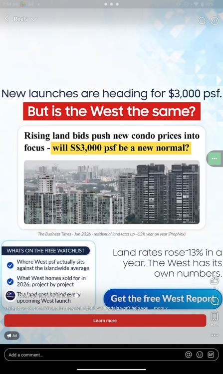
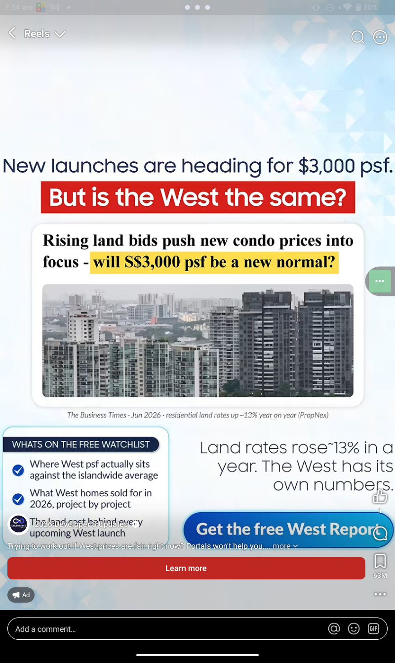
Ad

-
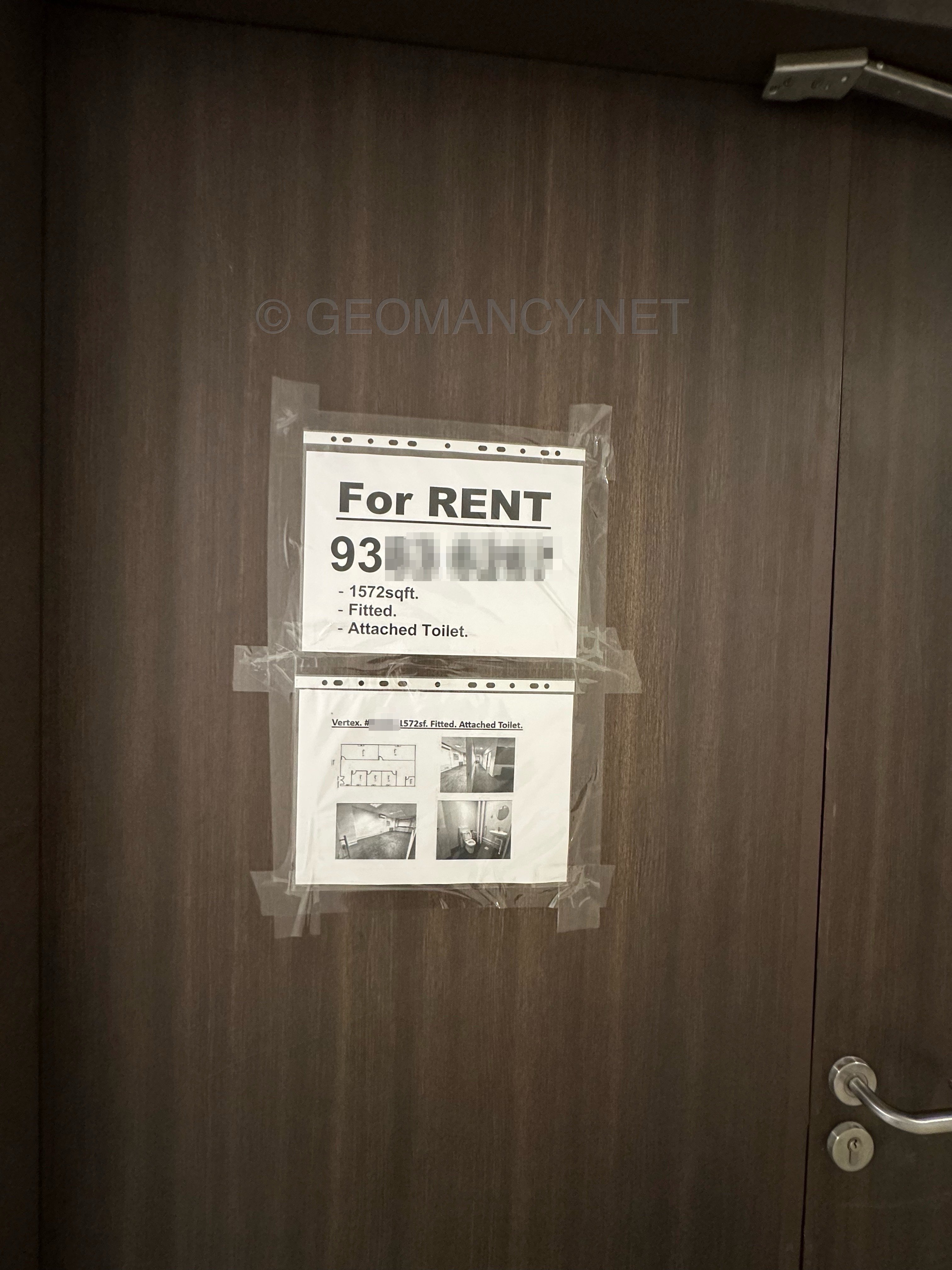
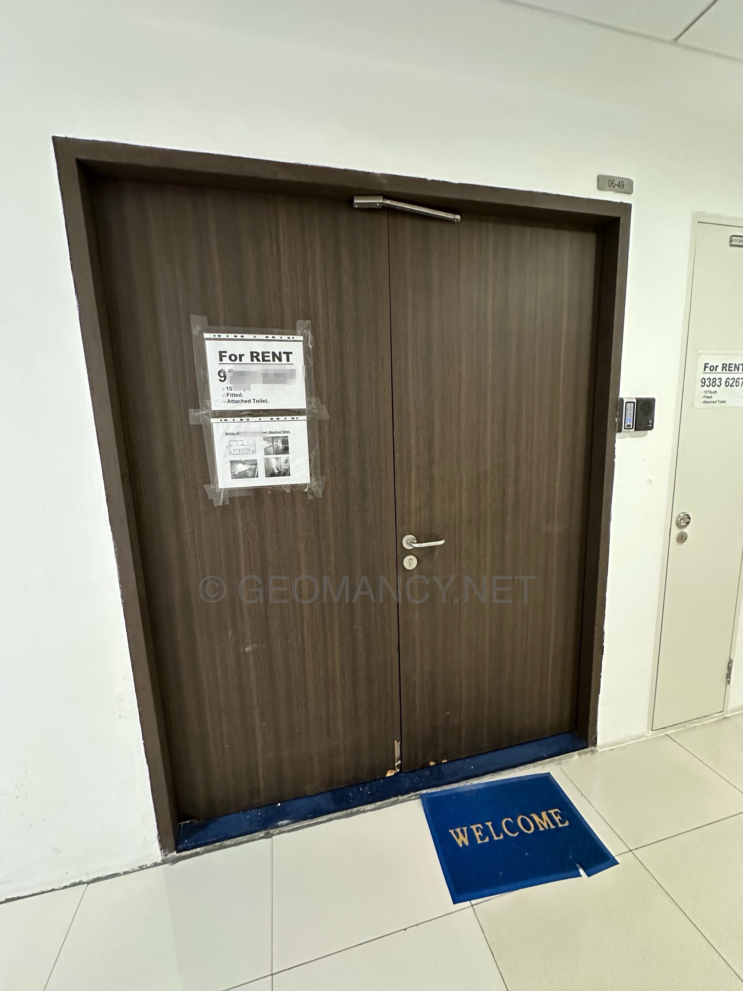
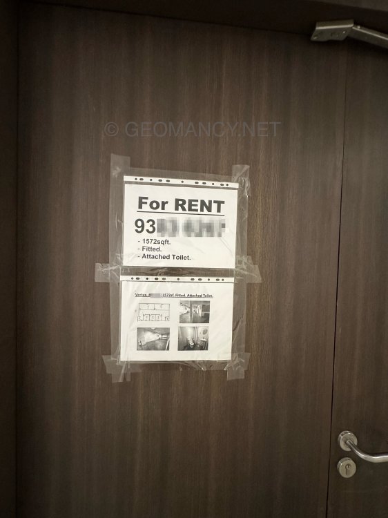
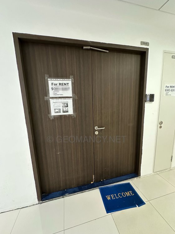
Another can or cannot rent review at Vertex, Ubi
-
-
Personalised Analysis Reports Personalised Reports Free Analysis Reports Find out your Life Association Sectors Find out your Gua (Kua) Number? East or West Group Person? Find out your Horoscope? Find out your Characteristics? Find out your Personal Element? How suitable is your Home? Your Favourable Sleep Position? Your Favourable Study Position? Your Favourable Work Position? Your Favourable Bedroom Location? Is your Apartment Number Auspicious? Generate Free Reports Generate 4 Good & 4 Bad Direction Report Generate Ba Zi Luck Analysis, Personal Element & Horoscope Insights- (FREEBAZI.GEOMANCY.NET) Generate 30 Days Auspicious Date for ONE or TWO Persons(DATE.GEOMANCY.NET) More FREE Reports Welcome to Personalized Analysis ReportsSince 1996, Geomancy.net has guided individuals in understanding Feng Shui and Chinese divination. With our expertise, we have assisted thousands, becoming a trusted resource for those seeking knowledge. Our personalized analysis reports empower you to tap into these ancient practices, significantly improving your quality of life. Discover the Power of Personalized Analysis ReportsAt ONLINE.GEOMANCY.NET, we provide free personalized analysis reports that empower you to understand the intricate connections between your living environment and your personal well-being. By leveraging time-honored techniques from Feng Shui and Chinese divination, our reports help you uncover valuable insights that can guide your decisions and improve your lifestyle. What We OfferOur comprehensive reports are designed to give you a holistic view of your life associations and environmental influences. Here’s what you can expect from our personalized analysis: Life Association SectorsUnderstanding your life association sectors is crucial for achieving balance and harmony. Our reports will reveal the areas of your life that are most influenced by your environment, helping you to focus your energy where it matters most. Your Gua (Kua) NumberYour Gua number is a vital aspect of Feng Shui that determines your personal energy profile. By calculating your Gua number, you can gain insights into your strengths and weaknesses, allowing you to make informed decisions that align with your true nature. East or West Group Person?Identifying whether you belong to the East or West group can significantly impact your approach to life. Our analysis will classify you accordingly, providing tailored recommendations for your personal growth and development. Horoscope InsightsAstrology plays a significant role in understanding your personality traits and life path. Our reports will include your horoscope, offering insights into your character and potential challenges you may face. Understanding Your CharacteristicsEvery individual has unique characteristics shaped by various factors. Our personalized reports will analyze these traits, helping you to understand how they influence your interactions and relationships. Your Personal ElementIn Feng Shui, the five elements (Wood, Fire, Earth, Metal, Water) play a crucial role in shaping your life. Our analysis will determine your personal element, providing insights that can help you harmonize with your environment. Assessing Your Home's SuitabilityYour living space significantly affects your overall well-being. Our reports will evaluate how suitable your home is for you, considering factors such as layout, direction, and energy flow. This assessment can guide you in making necessary adjustments to enhance your living environment. Favorable Sleep PositionDid you know that your sleep position can impact your health? Our analysis will suggest the best sleep position for you based on your personal energy profile, helping you achieve better rest and rejuvenation. Optimal Study PositionFor students and professionals alike, the right study position can enhance focus and productivity. Our reports will provide recommendations for your ideal study position, allowing you to maximize your learning potential. Favorable Work PositionYour work environment plays a critical role in your success. We will analyze your work position to ensure it aligns with your personal energy, promoting productivity and satisfaction in your professional life. Bedroom LocationThe location of your bedroom can influence your relationships and personal energy. Our reports will offer insights into the most beneficial bedroom location for you, fostering a peaceful and harmonious space. Auspicious Apartment NumbersDid you know that the number of your apartment can carry significant meaning? Our analysis will determine whether your apartment number is auspicious, guiding you towards a more favorable living situation. Generate Your Free ReportsReady to take the next step? Generating your free personalized analysis reports is simple: Login or Sign Up: Access your account at ONLINE.GEOMANCY.NET to get started. Choose Your Reports: Select from various reports, including: 4 Good & 4 Bad Direction Report Ba Zi Luck Analysis Personal Element Insights Horoscope Insights Receive Your Analysis: Once generated, your reports will be available for you to explore.
-
Personalised Analysis Reports Personalised Reports Free Analysis Reports Find out your Life Association Sectors Find out your Gua (Kua) Number? East or West Group Person? Find out your Horoscope? Find out your Characteristics? Find out your Personal Element? How suitable is your Home? Your Favourable Sleep Position? Your Favourable Study Position? Your Favourable Work Position? Your Favourable Bedroom Location? Is your Apartment Number Auspicious? Generate Free Reports Generate 4 Good & 4 Bad Direction Report Generate Ba Zi Luck Analysis, Personal Element & Horoscope Insights- (FREEBAZI.GEOMANCY.NET) Generate 30 Days Auspicious Date for ONE or TWO Persons(DATE.GEOMANCY.NET) More FREE Reports Welcome to Personalized Analysis ReportsSince 1996, Geomancy.net has guided individuals in understanding Feng Shui and Chinese divination. With our expertise, we have assisted thousands, becoming a trusted resource for those seeking knowledge. Our personalized analysis reports empower you to tap into these ancient practices, significantly improving your quality of life. Discover the Power of Personalized Analysis ReportsAt ONLINE.GEOMANCY.NET, we provide free personalized analysis reports that empower you to understand the intricate connections between your living environment and your personal well-being. By leveraging time-honored techniques from Feng Shui and Chinese divination, our reports help you uncover valuable insights that can guide your decisions and improve your lifestyle. What We OfferOur comprehensive reports are designed to give you a holistic view of your life associations and environmental influences. Here’s what you can expect from our personalized analysis: Life Association SectorsUnderstanding your life association sectors is crucial for achieving balance and harmony. Our reports will reveal the areas of your life that are most influenced by your environment, helping you to focus your energy where it matters most. Your Gua (Kua) NumberYour Gua number is a vital aspect of Feng Shui that determines your personal energy profile. By calculating your Gua number, you can gain insights into your strengths and weaknesses, allowing you to make informed decisions that align with your true nature. East or West Group Person?Identifying whether you belong to the East or West group can significantly impact your approach to life. Our analysis will classify you accordingly, providing tailored recommendations for your personal growth and development. Horoscope InsightsAstrology plays a significant role in understanding your personality traits and life path. Our reports will include your horoscope, offering insights into your character and potential challenges you may face. Understanding Your CharacteristicsEvery individual has unique characteristics shaped by various factors. Our personalized reports will analyze these traits, helping you to understand how they influence your interactions and relationships. Your Personal ElementIn Feng Shui, the five elements (Wood, Fire, Earth, Metal, Water) play a crucial role in shaping your life. Our analysis will determine your personal element, providing insights that can help you harmonize with your environment. Assessing Your Home's SuitabilityYour living space significantly affects your overall well-being. Our reports will evaluate how suitable your home is for you, considering factors such as layout, direction, and energy flow. This assessment can guide you in making necessary adjustments to enhance your living environment. Favorable Sleep PositionDid you know that your sleep position can impact your health? Our analysis will suggest the best sleep position for you based on your personal energy profile, helping you achieve better rest and rejuvenation. Optimal Study PositionFor students and professionals alike, the right study position can enhance focus and productivity. Our reports will provide recommendations for your ideal study position, allowing you to maximize your learning potential. Favorable Work PositionYour work environment plays a critical role in your success. We will analyze your work position to ensure it aligns with your personal energy, promoting productivity and satisfaction in your professional life. Bedroom LocationThe location of your bedroom can influence your relationships and personal energy. Our reports will offer insights into the most beneficial bedroom location for you, fostering a peaceful and harmonious space. Auspicious Apartment NumbersDid you know that the number of your apartment can carry significant meaning? Our analysis will determine whether your apartment number is auspicious, guiding you towards a more favorable living situation. Generate Your Free ReportsReady to take the next step? Generating your free personalized analysis reports is simple: Login or Sign Up: Access your account at ONLINE.GEOMANCY.NET to get started. Choose Your Reports: Select from various reports, including: 4 Good & 4 Bad Direction Report Ba Zi Luck Analysis Personal Element Insights Horoscope Insights Receive Your Analysis: Once generated, your reports will be available for you to explore.
-
Personalised Analysis Reports Personalised Reports Free Analysis Reports Find out your Life Association Sectors Find out your Gua (Kua) Number? East or West Group Person? Find out your Horoscope? Find out your Characteristics? Find out your Personal Element? How suitable is your Home? Your Favourable Sleep Position? Your Favourable Study Position? Your Favourable Work Position? Your Favourable Bedroom Location? Is your Apartment Number Auspicious? Generate Free Reports Generate 4 Good & 4 Bad Direction Report Generate Ba Zi Luck Analysis, Personal Element & Horoscope Insights- (FREEBAZI.GEOMANCY.NET) Generate 30 Days Auspicious Date for ONE or TWO Persons(DATE.GEOMANCY.NET) More FREE Reports Welcome to Personalized Analysis ReportsSince 1996, Geomancy.net has guided individuals in understanding Feng Shui and Chinese divination. With our expertise, we have assisted thousands, becoming a trusted resource for those seeking knowledge. Our personalized analysis reports empower you to tap into these ancient practices, significantly improving your quality of life. Discover the Power of Personalized Analysis ReportsAt ONLINE.GEOMANCY.NET, we provide free personalized analysis reports that empower you to understand the intricate connections between your living environment and your personal well-being. By leveraging time-honored techniques from Feng Shui and Chinese divination, our reports help you uncover valuable insights that can guide your decisions and improve your lifestyle. What We OfferOur comprehensive reports are designed to give you a holistic view of your life associations and environmental influences. Here’s what you can expect from our personalized analysis: Life Association SectorsUnderstanding your life association sectors is crucial for achieving balance and harmony. Our reports will reveal the areas of your life that are most influenced by your environment, helping you to focus your energy where it matters most. Your Gua (Kua) NumberYour Gua number is a vital aspect of Feng Shui that determines your personal energy profile. By calculating your Gua number, you can gain insights into your strengths and weaknesses, allowing you to make informed decisions that align with your true nature. East or West Group Person?Identifying whether you belong to the East or West group can significantly impact your approach to life. Our analysis will classify you accordingly, providing tailored recommendations for your personal growth and development. Horoscope InsightsAstrology plays a significant role in understanding your personality traits and life path. Our reports will include your horoscope, offering insights into your character and potential challenges you may face. Understanding Your CharacteristicsEvery individual has unique characteristics shaped by various factors. Our personalized reports will analyze these traits, helping you to understand how they influence your interactions and relationships. Your Personal ElementIn Feng Shui, the five elements (Wood, Fire, Earth, Metal, Water) play a crucial role in shaping your life. Our analysis will determine your personal element, providing insights that can help you harmonize with your environment. Assessing Your Home's SuitabilityYour living space significantly affects your overall well-being. Our reports will evaluate how suitable your home is for you, considering factors such as layout, direction, and energy flow. This assessment can guide you in making necessary adjustments to enhance your living environment. Favorable Sleep PositionDid you know that your sleep position can impact your health? Our analysis will suggest the best sleep position for you based on your personal energy profile, helping you achieve better rest and rejuvenation. Optimal Study PositionFor students and professionals alike, the right study position can enhance focus and productivity. Our reports will provide recommendations for your ideal study position, allowing you to maximize your learning potential. Favorable Work PositionYour work environment plays a critical role in your success. We will analyze your work position to ensure it aligns with your personal energy, promoting productivity and satisfaction in your professional life. Bedroom LocationThe location of your bedroom can influence your relationships and personal energy. Our reports will offer insights into the most beneficial bedroom location for you, fostering a peaceful and harmonious space. Auspicious Apartment NumbersDid you know that the number of your apartment can carry significant meaning? Our analysis will determine whether your apartment number is auspicious, guiding you towards a more favorable living situation. Generate Your Free ReportsReady to take the next step? Generating your free personalized analysis reports is simple: Login or Sign Up: Access your account at ONLINE.GEOMANCY.NET to get started. Choose Your Reports: Select from various reports, including: 4 Good & 4 Bad Direction Report Ba Zi Luck Analysis Personal Element Insights Horoscope Insights Receive Your Analysis: Once generated, your reports will be available for you to explore.
-
Personalised Analysis Reports Personalised Reports Free Analysis Reports Find out your Life Association Sectors Find out your Gua (Kua) Number? East or West Group Person? Find out your Horoscope? Find out your Characteristics? Find out your Personal Element? How suitable is your Home? Your Favourable Sleep Position? Your Favourable Study Position? Your Favourable Work Position? Your Favourable Bedroom Location? Is your Apartment Number Auspicious? Generate Free Reports Generate 4 Good & 4 Bad Direction Report Generate Ba Zi Luck Analysis, Personal Element & Horoscope Insights- (FREEBAZI.GEOMANCY.NET) Generate 30 Days Auspicious Date for ONE or TWO Persons(DATE.GEOMANCY.NET) More FREE Reports Welcome to Personalized Analysis ReportsSince 1996, Geomancy.net has guided individuals in understanding Feng Shui and Chinese divination. With our expertise, we have assisted thousands, becoming a trusted resource for those seeking knowledge. Our personalized analysis reports empower you to tap into these ancient practices, significantly improving your quality of life. Discover the Power of Personalized Analysis ReportsAt ONLINE.GEOMANCY.NET, we provide free personalized analysis reports that empower you to understand the intricate connections between your living environment and your personal well-being. By leveraging time-honored techniques from Feng Shui and Chinese divination, our reports help you uncover valuable insights that can guide your decisions and improve your lifestyle. What We OfferOur comprehensive reports are designed to give you a holistic view of your life associations and environmental influences. Here’s what you can expect from our personalized analysis: Life Association SectorsUnderstanding your life association sectors is crucial for achieving balance and harmony. Our reports will reveal the areas of your life that are most influenced by your environment, helping you to focus your energy where it matters most. Your Gua (Kua) NumberYour Gua number is a vital aspect of Feng Shui that determines your personal energy profile. By calculating your Gua number, you can gain insights into your strengths and weaknesses, allowing you to make informed decisions that align with your true nature. East or West Group Person?Identifying whether you belong to the East or West group can significantly impact your approach to life. Our analysis will classify you accordingly, providing tailored recommendations for your personal growth and development. Horoscope InsightsAstrology plays a significant role in understanding your personality traits and life path. Our reports will include your horoscope, offering insights into your character and potential challenges you may face. Understanding Your CharacteristicsEvery individual has unique characteristics shaped by various factors. Our personalized reports will analyze these traits, helping you to understand how they influence your interactions and relationships. Your Personal ElementIn Feng Shui, the five elements (Wood, Fire, Earth, Metal, Water) play a crucial role in shaping your life. Our analysis will determine your personal element, providing insights that can help you harmonize with your environment. Assessing Your Home's SuitabilityYour living space significantly affects your overall well-being. Our reports will evaluate how suitable your home is for you, considering factors such as layout, direction, and energy flow. This assessment can guide you in making necessary adjustments to enhance your living environment. Favorable Sleep PositionDid you know that your sleep position can impact your health? Our analysis will suggest the best sleep position for you based on your personal energy profile, helping you achieve better rest and rejuvenation. Optimal Study PositionFor students and professionals alike, the right study position can enhance focus and productivity. Our reports will provide recommendations for your ideal study position, allowing you to maximize your learning potential. Favorable Work PositionYour work environment plays a critical role in your success. We will analyze your work position to ensure it aligns with your personal energy, promoting productivity and satisfaction in your professional life. Bedroom LocationThe location of your bedroom can influence your relationships and personal energy. Our reports will offer insights into the most beneficial bedroom location for you, fostering a peaceful and harmonious space. Auspicious Apartment NumbersDid you know that the number of your apartment can carry significant meaning? Our analysis will determine whether your apartment number is auspicious, guiding you towards a more favorable living situation. Generate Your Free ReportsReady to take the next step? Generating your free personalized analysis reports is simple: Login or Sign Up: Access your account at ONLINE.GEOMANCY.NET to get started. Choose Your Reports: Select from various reports, including: 4 Good & 4 Bad Direction Report Ba Zi Luck Analysis Personal Element Insights Horoscope Insights Receive Your Analysis: Once generated, your reports will be available for you to explore.
-
Personalised Analysis Reports Personalised Reports Free Analysis Reports Find out your Life Association Sectors Find out your Gua (Kua) Number? East or West Group Person? Find out your Horoscope? Find out your Characteristics? Find out your Personal Element? How suitable is your Home? Your Favourable Sleep Position? Your Favourable Study Position? Your Favourable Work Position? Your Favourable Bedroom Location? Is your Apartment Number Auspicious? Generate Free Reports Generate 4 Good & 4 Bad Direction Report Generate Ba Zi Luck Analysis, Personal Element & Horoscope Insights- (FREEBAZI.GEOMANCY.NET) Generate 30 Days Auspicious Date for ONE or TWO Persons(DATE.GEOMANCY.NET) More FREE Reports Welcome to Personalized Analysis ReportsSince 1996, Geomancy.net has guided individuals in understanding Feng Shui and Chinese divination. With our expertise, we have assisted thousands, becoming a trusted resource for those seeking knowledge. Our personalized analysis reports empower you to tap into these ancient practices, significantly improving your quality of life. Discover the Power of Personalized Analysis ReportsAt ONLINE.GEOMANCY.NET, we provide free personalized analysis reports that empower you to understand the intricate connections between your living environment and your personal well-being. By leveraging time-honored techniques from Feng Shui and Chinese divination, our reports help you uncover valuable insights that can guide your decisions and improve your lifestyle. What We OfferOur comprehensive reports are designed to give you a holistic view of your life associations and environmental influences. Here’s what you can expect from our personalized analysis: Life Association SectorsUnderstanding your life association sectors is crucial for achieving balance and harmony. Our reports will reveal the areas of your life that are most influenced by your environment, helping you to focus your energy where it matters most. Your Gua (Kua) NumberYour Gua number is a vital aspect of Feng Shui that determines your personal energy profile. By calculating your Gua number, you can gain insights into your strengths and weaknesses, allowing you to make informed decisions that align with your true nature. East or West Group Person?Identifying whether you belong to the East or West group can significantly impact your approach to life. Our analysis will classify you accordingly, providing tailored recommendations for your personal growth and development. Horoscope InsightsAstrology plays a significant role in understanding your personality traits and life path. Our reports will include your horoscope, offering insights into your character and potential challenges you may face. Understanding Your CharacteristicsEvery individual has unique characteristics shaped by various factors. Our personalized reports will analyze these traits, helping you to understand how they influence your interactions and relationships. Your Personal ElementIn Feng Shui, the five elements (Wood, Fire, Earth, Metal, Water) play a crucial role in shaping your life. Our analysis will determine your personal element, providing insights that can help you harmonize with your environment. Assessing Your Home's SuitabilityYour living space significantly affects your overall well-being. Our reports will evaluate how suitable your home is for you, considering factors such as layout, direction, and energy flow. This assessment can guide you in making necessary adjustments to enhance your living environment. Favorable Sleep PositionDid you know that your sleep position can impact your health? Our analysis will suggest the best sleep position for you based on your personal energy profile, helping you achieve better rest and rejuvenation. Optimal Study PositionFor students and professionals alike, the right study position can enhance focus and productivity. Our reports will provide recommendations for your ideal study position, allowing you to maximize your learning potential. Favorable Work PositionYour work environment plays a critical role in your success. We will analyze your work position to ensure it aligns with your personal energy, promoting productivity and satisfaction in your professional life. Bedroom LocationThe location of your bedroom can influence your relationships and personal energy. Our reports will offer insights into the most beneficial bedroom location for you, fostering a peaceful and harmonious space. Auspicious Apartment NumbersDid you know that the number of your apartment can carry significant meaning? Our analysis will determine whether your apartment number is auspicious, guiding you towards a more favorable living situation. Generate Your Free ReportsReady to take the next step? Generating your free personalized analysis reports is simple: Login or Sign Up: Access your account at ONLINE.GEOMANCY.NET to get started. Choose Your Reports: Select from various reports, including: 4 Good & 4 Bad Direction Report Ba Zi Luck Analysis Personal Element Insights Horoscope Insights Receive Your Analysis: Once generated, your reports will be available for you to explore.
-
Personalised Analysis Reports Personalised Reports Free Analysis Reports Find out your Life Association Sectors Find out your Gua (Kua) Number? East or West Group Person? Find out your Horoscope? Find out your Characteristics? Find out your Personal Element? How suitable is your Home? Your Favourable Sleep Position? Your Favourable Study Position? Your Favourable Work Position? Your Favourable Bedroom Location? Is your Apartment Number Auspicious? Generate Free Reports Generate 4 Good & 4 Bad Direction Report Generate Ba Zi Luck Analysis, Personal Element & Horoscope Insights- (FREEBAZI.GEOMANCY.NET) Generate 30 Days Auspicious Date for ONE or TWO Persons(DATE.GEOMANCY.NET) More FREE Reports Welcome to Personalized Analysis ReportsSince 1996, Geomancy.net has guided individuals in understanding Feng Shui and Chinese divination. With our expertise, we have assisted thousands, becoming a trusted resource for those seeking knowledge. Our personalized analysis reports empower you to tap into these ancient practices, significantly improving your quality of life. Discover the Power of Personalized Analysis ReportsAt ONLINE.GEOMANCY.NET, we provide free personalized analysis reports that empower you to understand the intricate connections between your living environment and your personal well-being. By leveraging time-honored techniques from Feng Shui and Chinese divination, our reports help you uncover valuable insights that can guide your decisions and improve your lifestyle. What We OfferOur comprehensive reports are designed to give you a holistic view of your life associations and environmental influences. Here’s what you can expect from our personalized analysis: Life Association SectorsUnderstanding your life association sectors is crucial for achieving balance and harmony. Our reports will reveal the areas of your life that are most influenced by your environment, helping you to focus your energy where it matters most. Your Gua (Kua) NumberYour Gua number is a vital aspect of Feng Shui that determines your personal energy profile. By calculating your Gua number, you can gain insights into your strengths and weaknesses, allowing you to make informed decisions that align with your true nature. East or West Group Person?Identifying whether you belong to the East or West group can significantly impact your approach to life. Our analysis will classify you accordingly, providing tailored recommendations for your personal growth and development. Horoscope InsightsAstrology plays a significant role in understanding your personality traits and life path. Our reports will include your horoscope, offering insights into your character and potential challenges you may face. Understanding Your CharacteristicsEvery individual has unique characteristics shaped by various factors. Our personalized reports will analyze these traits, helping you to understand how they influence your interactions and relationships. Your Personal ElementIn Feng Shui, the five elements (Wood, Fire, Earth, Metal, Water) play a crucial role in shaping your life. Our analysis will determine your personal element, providing insights that can help you harmonize with your environment. Assessing Your Home's SuitabilityYour living space significantly affects your overall well-being. Our reports will evaluate how suitable your home is for you, considering factors such as layout, direction, and energy flow. This assessment can guide you in making necessary adjustments to enhance your living environment. Favorable Sleep PositionDid you know that your sleep position can impact your health? Our analysis will suggest the best sleep position for you based on your personal energy profile, helping you achieve better rest and rejuvenation. Optimal Study PositionFor students and professionals alike, the right study position can enhance focus and productivity. Our reports will provide recommendations for your ideal study position, allowing you to maximize your learning potential. Favorable Work PositionYour work environment plays a critical role in your success. We will analyze your work position to ensure it aligns with your personal energy, promoting productivity and satisfaction in your professional life. Bedroom LocationThe location of your bedroom can influence your relationships and personal energy. Our reports will offer insights into the most beneficial bedroom location for you, fostering a peaceful and harmonious space. Auspicious Apartment NumbersDid you know that the number of your apartment can carry significant meaning? Our analysis will determine whether your apartment number is auspicious, guiding you towards a more favorable living situation. Generate Your Free ReportsReady to take the next step? Generating your free personalized analysis reports is simple: Login or Sign Up: Access your account at ONLINE.GEOMANCY.NET to get started. Choose Your Reports: Select from various reports, including: 4 Good & 4 Bad Direction Report Ba Zi Luck Analysis Personal Element Insights Horoscope Insights Receive Your Analysis: Once generated, your reports will be available for you to explore.
-
Personalised Analysis Reports Personalised Reports Free Analysis Reports Find out your Life Association Sectors Find out your Gua (Kua) Number? East or West Group Person? Find out your Horoscope? Find out your Characteristics? Find out your Personal Element? How suitable is your Home? Your Favourable Sleep Position? Your Favourable Study Position? Your Favourable Work Position? Your Favourable Bedroom Location? Is your Apartment Number Auspicious? Generate Free Reports Generate 4 Good & 4 Bad Direction Report Generate Ba Zi Luck Analysis, Personal Element & Horoscope Insights- (FREEBAZI.GEOMANCY.NET) Generate 30 Days Auspicious Date for ONE or TWO Persons(DATE.GEOMANCY.NET) More FREE Reports Welcome to Personalized Analysis ReportsSince 1996, Geomancy.net has guided individuals in understanding Feng Shui and Chinese divination. With our expertise, we have assisted thousands, becoming a trusted resource for those seeking knowledge. Our personalized analysis reports empower you to tap into these ancient practices, significantly improving your quality of life. Discover the Power of Personalized Analysis ReportsAt ONLINE.GEOMANCY.NET, we provide free personalized analysis reports that empower you to understand the intricate connections between your living environment and your personal well-being. By leveraging time-honored techniques from Feng Shui and Chinese divination, our reports help you uncover valuable insights that can guide your decisions and improve your lifestyle. What We OfferOur comprehensive reports are designed to give you a holistic view of your life associations and environmental influences. Here’s what you can expect from our personalized analysis: Life Association SectorsUnderstanding your life association sectors is crucial for achieving balance and harmony. Our reports will reveal the areas of your life that are most influenced by your environment, helping you to focus your energy where it matters most. Your Gua (Kua) NumberYour Gua number is a vital aspect of Feng Shui that determines your personal energy profile. By calculating your Gua number, you can gain insights into your strengths and weaknesses, allowing you to make informed decisions that align with your true nature. East or West Group Person?Identifying whether you belong to the East or West group can significantly impact your approach to life. Our analysis will classify you accordingly, providing tailored recommendations for your personal growth and development. Horoscope InsightsAstrology plays a significant role in understanding your personality traits and life path. Our reports will include your horoscope, offering insights into your character and potential challenges you may face. Understanding Your CharacteristicsEvery individual has unique characteristics shaped by various factors. Our personalized reports will analyze these traits, helping you to understand how they influence your interactions and relationships. Your Personal ElementIn Feng Shui, the five elements (Wood, Fire, Earth, Metal, Water) play a crucial role in shaping your life. Our analysis will determine your personal element, providing insights that can help you harmonize with your environment. Assessing Your Home's SuitabilityYour living space significantly affects your overall well-being. Our reports will evaluate how suitable your home is for you, considering factors such as layout, direction, and energy flow. This assessment can guide you in making necessary adjustments to enhance your living environment. Favorable Sleep PositionDid you know that your sleep position can impact your health? Our analysis will suggest the best sleep position for you based on your personal energy profile, helping you achieve better rest and rejuvenation. Optimal Study PositionFor students and professionals alike, the right study position can enhance focus and productivity. Our reports will provide recommendations for your ideal study position, allowing you to maximize your learning potential. Favorable Work PositionYour work environment plays a critical role in your success. We will analyze your work position to ensure it aligns with your personal energy, promoting productivity and satisfaction in your professional life. Bedroom LocationThe location of your bedroom can influence your relationships and personal energy. Our reports will offer insights into the most beneficial bedroom location for you, fostering a peaceful and harmonious space. Auspicious Apartment NumbersDid you know that the number of your apartment can carry significant meaning? Our analysis will determine whether your apartment number is auspicious, guiding you towards a more favorable living situation. Generate Your Free ReportsReady to take the next step? Generating your free personalized analysis reports is simple: Login or Sign Up: Access your account at ONLINE.GEOMANCY.NET to get started. Choose Your Reports: Select from various reports, including: 4 Good & 4 Bad Direction Report Ba Zi Luck Analysis Personal Element Insights Horoscope Insights Receive Your Analysis: Once generated, your reports will be available for you to explore.
-
 Personalised Analysis Reports Personalised Reports Free Analysis Reports Find out your Life Association Sectors Find out your Gua (Kua) Number? East or West Group Person? Find out your Horoscope? Find out your Characteristics? Find out your Personal Element? How suitable is your Home? Your Favourable Sleep Position? Your Favourable Study Position? Your Favourable Work Position? Your Favourable Bedroom Location? Is your Apartment Number Auspicious? Generate Free Reports Generate 4 Good & 4 Bad Direction Report Generate Ba Zi Luck Analysis, Personal Element & Horoscope Insights- (FREEBAZI.GEOMANCY.NET) Generate 30 Days Auspicious Date for ONE or TWO Persons(DATE.GEOMANCY.NET) More FREE Reports Welcome to Personalized Analysis ReportsSince 1996, Geomancy.net has guided individuals in understanding Feng Shui and Chinese divination. With our expertise, we have assisted thousands, becoming a trusted resource for those seeking knowledge. Our personalized analysis reports empower you to tap into these ancient practices, significantly improving your quality of life. Discover the Power of Personalized Analysis ReportsAt ONLINE.GEOMANCY.NET, we provide free personalized analysis reports that empower you to understand the intricate connections between your living environment and your personal well-being. By leveraging time-honored techniques from Feng Shui and Chinese divination, our reports help you uncover valuable insights that can guide your decisions and improve your lifestyle. What We OfferOur comprehensive reports are designed to give you a holistic view of your life associations and environmental influences. Here’s what you can expect from our personalized analysis: Life Association SectorsUnderstanding your life association sectors is crucial for achieving balance and harmony. Our reports will reveal the areas of your life that are most influenced by your environment, helping you to focus your energy where it matters most. Your Gua (Kua) NumberYour Gua number is a vital aspect of Feng Shui that determines your personal energy profile. By calculating your Gua number, you can gain insights into your strengths and weaknesses, allowing you to make informed decisions that align with your true nature. East or West Group Person?Identifying whether you belong to the East or West group can significantly impact your approach to life. Our analysis will classify you accordingly, providing tailored recommendations for your personal growth and development. Horoscope InsightsAstrology plays a significant role in understanding your personality traits and life path. Our reports will include your horoscope, offering insights into your character and potential challenges you may face. Understanding Your CharacteristicsEvery individual has unique characteristics shaped by various factors. Our personalized reports will analyze these traits, helping you to understand how they influence your interactions and relationships. Your Personal ElementIn Feng Shui, the five elements (Wood, Fire, Earth, Metal, Water) play a crucial role in shaping your life. Our analysis will determine your personal element, providing insights that can help you harmonize with your environment. Assessing Your Home's SuitabilityYour living space significantly affects your overall well-being. Our reports will evaluate how suitable your home is for you, considering factors such as layout, direction, and energy flow. This assessment can guide you in making necessary adjustments to enhance your living environment. Favorable Sleep PositionDid you know that your sleep position can impact your health? Our analysis will suggest the best sleep position for you based on your personal energy profile, helping you achieve better rest and rejuvenation. Optimal Study PositionFor students and professionals alike, the right study position can enhance focus and productivity. Our reports will provide recommendations for your ideal study position, allowing you to maximize your learning potential. Favorable Work PositionYour work environment plays a critical role in your success. We will analyze your work position to ensure it aligns with your personal energy, promoting productivity and satisfaction in your professional life. Bedroom LocationThe location of your bedroom can influence your relationships and personal energy. Our reports will offer insights into the most beneficial bedroom location for you, fostering a peaceful and harmonious space. Auspicious Apartment NumbersDid you know that the number of your apartment can carry significant meaning? Our analysis will determine whether your apartment number is auspicious, guiding you towards a more favorable living situation. Generate Your Free ReportsReady to take the next step? Generating your free personalized analysis reports is simple: Login or Sign Up: Access your account at ONLINE.GEOMANCY.NET to get started. Choose Your Reports: Select from various reports, including: 4 Good & 4 Bad Direction Report Ba Zi Luck Analysis Personal Element Insights Horoscope Insights Receive Your Analysis: Once generated, your reports will be available for you to explore.
 -
-
Personalised Analysis Reports Personalised Reports Free Analysis Reports Find out your Life Association Sectors Find out your Gua (Kua) Number? East or West Group Person? Find out your Horoscope? Find out your Characteristics? Find out your Personal Element? How suitable is your Home? Your Favourable Sleep Position? Your Favourable Study Position? Your Favourable Work Position? Your Favourable Bedroom Location? Is your Apartment Number Auspicious? Generate Free Reports Generate 4 Good & 4 Bad Direction Report Generate Ba Zi Luck Analysis, Personal Element & Horoscope Insights- (FREEBAZI.GEOMANCY.NET) Generate 30 Days Auspicious Date for ONE or TWO Persons(DATE.GEOMANCY.NET) More FREE Reports Welcome to Personalized Analysis ReportsSince 1996, Geomancy.net has guided individuals in understanding Feng Shui and Chinese divination. With our expertise, we have assisted thousands, becoming a trusted resource for those seeking knowledge. Our personalized analysis reports empower you to tap into these ancient practices, significantly improving your quality of life. Discover the Power of Personalized Analysis ReportsAt ONLINE.GEOMANCY.NET, we provide free personalized analysis reports that empower you to understand the intricate connections between your living environment and your personal well-being. By leveraging time-honored techniques from Feng Shui and Chinese divination, our reports help you uncover valuable insights that can guide your decisions and improve your lifestyle. What We OfferOur comprehensive reports are designed to give you a holistic view of your life associations and environmental influences. Here’s what you can expect from our personalized analysis: Life Association SectorsUnderstanding your life association sectors is crucial for achieving balance and harmony. Our reports will reveal the areas of your life that are most influenced by your environment, helping you to focus your energy where it matters most. Your Gua (Kua) NumberYour Gua number is a vital aspect of Feng Shui that determines your personal energy profile. By calculating your Gua number, you can gain insights into your strengths and weaknesses, allowing you to make informed decisions that align with your true nature. East or West Group Person?Identifying whether you belong to the East or West group can significantly impact your approach to life. Our analysis will classify you accordingly, providing tailored recommendations for your personal growth and development. Horoscope InsightsAstrology plays a significant role in understanding your personality traits and life path. Our reports will include your horoscope, offering insights into your character and potential challenges you may face. Understanding Your CharacteristicsEvery individual has unique characteristics shaped by various factors. Our personalized reports will analyze these traits, helping you to understand how they influence your interactions and relationships. Your Personal ElementIn Feng Shui, the five elements (Wood, Fire, Earth, Metal, Water) play a crucial role in shaping your life. Our analysis will determine your personal element, providing insights that can help you harmonize with your environment. Assessing Your Home's SuitabilityYour living space significantly affects your overall well-being. Our reports will evaluate how suitable your home is for you, considering factors such as layout, direction, and energy flow. This assessment can guide you in making necessary adjustments to enhance your living environment. Favorable Sleep PositionDid you know that your sleep position can impact your health? Our analysis will suggest the best sleep position for you based on your personal energy profile, helping you achieve better rest and rejuvenation. Optimal Study PositionFor students and professionals alike, the right study position can enhance focus and productivity. Our reports will provide recommendations for your ideal study position, allowing you to maximize your learning potential. Favorable Work PositionYour work environment plays a critical role in your success. We will analyze your work position to ensure it aligns with your personal energy, promoting productivity and satisfaction in your professional life. Bedroom LocationThe location of your bedroom can influence your relationships and personal energy. Our reports will offer insights into the most beneficial bedroom location for you, fostering a peaceful and harmonious space. Auspicious Apartment NumbersDid you know that the number of your apartment can carry significant meaning? Our analysis will determine whether your apartment number is auspicious, guiding you towards a more favorable living situation. Generate Your Free ReportsReady to take the next step? Generating your free personalized analysis reports is simple: Login or Sign Up: Access your account at ONLINE.GEOMANCY.NET to get started. Choose Your Reports: Select from various reports, including: 4 Good & 4 Bad Direction Report Ba Zi Luck Analysis Personal Element Insights Horoscope Insights Receive Your Analysis: Once generated, your reports will be available for you to explore.
-
Personalised Analysis Reports Personalised Reports Free Analysis Reports Find out your Life Association Sectors Find out your Gua (Kua) Number? East or West Group Person? Find out your Horoscope? Find out your Characteristics? Find out your Personal Element? How suitable is your Home? Your Favourable Sleep Position? Your Favourable Study Position? Your Favourable Work Position? Your Favourable Bedroom Location? Is your Apartment Number Auspicious? Generate Free Reports Generate 4 Good & 4 Bad Direction Report Generate Ba Zi Luck Analysis, Personal Element & Horoscope Insights- (FREEBAZI.GEOMANCY.NET) Generate 30 Days Auspicious Date for ONE or TWO Persons(DATE.GEOMANCY.NET) More FREE Reports Welcome to Personalized Analysis ReportsSince 1996, Geomancy.net has guided individuals in understanding Feng Shui and Chinese divination. With our expertise, we have assisted thousands, becoming a trusted resource for those seeking knowledge. Our personalized analysis reports empower you to tap into these ancient practices, significantly improving your quality of life. Discover the Power of Personalized Analysis ReportsAt ONLINE.GEOMANCY.NET, we provide free personalized analysis reports that empower you to understand the intricate connections between your living environment and your personal well-being. By leveraging time-honored techniques from Feng Shui and Chinese divination, our reports help you uncover valuable insights that can guide your decisions and improve your lifestyle. What We OfferOur comprehensive reports are designed to give you a holistic view of your life associations and environmental influences. Here’s what you can expect from our personalized analysis: Life Association SectorsUnderstanding your life association sectors is crucial for achieving balance and harmony. Our reports will reveal the areas of your life that are most influenced by your environment, helping you to focus your energy where it matters most. Your Gua (Kua) NumberYour Gua number is a vital aspect of Feng Shui that determines your personal energy profile. By calculating your Gua number, you can gain insights into your strengths and weaknesses, allowing you to make informed decisions that align with your true nature. East or West Group Person?Identifying whether you belong to the East or West group can significantly impact your approach to life. Our analysis will classify you accordingly, providing tailored recommendations for your personal growth and development. Horoscope InsightsAstrology plays a significant role in understanding your personality traits and life path. Our reports will include your horoscope, offering insights into your character and potential challenges you may face. Understanding Your CharacteristicsEvery individual has unique characteristics shaped by various factors. Our personalized reports will analyze these traits, helping you to understand how they influence your interactions and relationships. Your Personal ElementIn Feng Shui, the five elements (Wood, Fire, Earth, Metal, Water) play a crucial role in shaping your life. Our analysis will determine your personal element, providing insights that can help you harmonize with your environment. Assessing Your Home's SuitabilityYour living space significantly affects your overall well-being. Our reports will evaluate how suitable your home is for you, considering factors such as layout, direction, and energy flow. This assessment can guide you in making necessary adjustments to enhance your living environment. Favorable Sleep PositionDid you know that your sleep position can impact your health? Our analysis will suggest the best sleep position for you based on your personal energy profile, helping you achieve better rest and rejuvenation. Optimal Study PositionFor students and professionals alike, the right study position can enhance focus and productivity. Our reports will provide recommendations for your ideal study position, allowing you to maximize your learning potential. Favorable Work PositionYour work environment plays a critical role in your success. We will analyze your work position to ensure it aligns with your personal energy, promoting productivity and satisfaction in your professional life. Bedroom LocationThe location of your bedroom can influence your relationships and personal energy. Our reports will offer insights into the most beneficial bedroom location for you, fostering a peaceful and harmonious space. Auspicious Apartment NumbersDid you know that the number of your apartment can carry significant meaning? Our analysis will determine whether your apartment number is auspicious, guiding you towards a more favorable living situation. Generate Your Free ReportsReady to take the next step? Generating your free personalized analysis reports is simple: Login or Sign Up: Access your account at ONLINE.GEOMANCY.NET to get started. Choose Your Reports: Select from various reports, including: 4 Good & 4 Bad Direction Report Ba Zi Luck Analysis Personal Element Insights Horoscope Insights Receive Your Analysis: Once generated, your reports will be available for you to explore.
-
Personalised Analysis Reports Personalised Reports Free Analysis Reports Find out your Life Association Sectors Find out your Gua (Kua) Number? East or West Group Person? Find out your Horoscope? Find out your Characteristics? Find out your Personal Element? How suitable is your Home? Your Favourable Sleep Position? Your Favourable Study Position? Your Favourable Work Position? Your Favourable Bedroom Location? Is your Apartment Number Auspicious? Generate Free Reports Generate 4 Good & 4 Bad Direction Report Generate Ba Zi Luck Analysis, Personal Element & Horoscope Insights- (FREEBAZI.GEOMANCY.NET) Generate 30 Days Auspicious Date for ONE or TWO Persons(DATE.GEOMANCY.NET) More FREE Reports Welcome to Personalized Analysis ReportsSince 1996, Geomancy.net has guided individuals in understanding Feng Shui and Chinese divination. With our expertise, we have assisted thousands, becoming a trusted resource for those seeking knowledge. Our personalized analysis reports empower you to tap into these ancient practices, significantly improving your quality of life. Discover the Power of Personalized Analysis ReportsAt ONLINE.GEOMANCY.NET, we provide free personalized analysis reports that empower you to understand the intricate connections between your living environment and your personal well-being. By leveraging time-honored techniques from Feng Shui and Chinese divination, our reports help you uncover valuable insights that can guide your decisions and improve your lifestyle. What We OfferOur comprehensive reports are designed to give you a holistic view of your life associations and environmental influences. Here’s what you can expect from our personalized analysis: Life Association SectorsUnderstanding your life association sectors is crucial for achieving balance and harmony. Our reports will reveal the areas of your life that are most influenced by your environment, helping you to focus your energy where it matters most. Your Gua (Kua) NumberYour Gua number is a vital aspect of Feng Shui that determines your personal energy profile. By calculating your Gua number, you can gain insights into your strengths and weaknesses, allowing you to make informed decisions that align with your true nature. East or West Group Person?Identifying whether you belong to the East or West group can significantly impact your approach to life. Our analysis will classify you accordingly, providing tailored recommendations for your personal growth and development. Horoscope InsightsAstrology plays a significant role in understanding your personality traits and life path. Our reports will include your horoscope, offering insights into your character and potential challenges you may face. Understanding Your CharacteristicsEvery individual has unique characteristics shaped by various factors. Our personalized reports will analyze these traits, helping you to understand how they influence your interactions and relationships. Your Personal ElementIn Feng Shui, the five elements (Wood, Fire, Earth, Metal, Water) play a crucial role in shaping your life. Our analysis will determine your personal element, providing insights that can help you harmonize with your environment. Assessing Your Home's SuitabilityYour living space significantly affects your overall well-being. Our reports will evaluate how suitable your home is for you, considering factors such as layout, direction, and energy flow. This assessment can guide you in making necessary adjustments to enhance your living environment. Favorable Sleep PositionDid you know that your sleep position can impact your health? Our analysis will suggest the best sleep position for you based on your personal energy profile, helping you achieve better rest and rejuvenation. Optimal Study PositionFor students and professionals alike, the right study position can enhance focus and productivity. Our reports will provide recommendations for your ideal study position, allowing you to maximize your learning potential. Favorable Work PositionYour work environment plays a critical role in your success. We will analyze your work position to ensure it aligns with your personal energy, promoting productivity and satisfaction in your professional life. Bedroom LocationThe location of your bedroom can influence your relationships and personal energy. Our reports will offer insights into the most beneficial bedroom location for you, fostering a peaceful and harmonious space. Auspicious Apartment NumbersDid you know that the number of your apartment can carry significant meaning? Our analysis will determine whether your apartment number is auspicious, guiding you towards a more favorable living situation. Generate Your Free ReportsReady to take the next step? Generating your free personalized analysis reports is simple: Login or Sign Up: Access your account at ONLINE.GEOMANCY.NET to get started. Choose Your Reports: Select from various reports, including: 4 Good & 4 Bad Direction Report Ba Zi Luck Analysis Personal Element Insights Horoscope Insights Receive Your Analysis: Once generated, your reports will be available for you to explore.
-
Personalised Analysis Reports Personalised Reports Free Analysis Reports Find out your Life Association Sectors Find out your Gua (Kua) Number? East or West Group Person? Find out your Horoscope? Find out your Characteristics? Find out your Personal Element? How suitable is your Home? Your Favourable Sleep Position? Your Favourable Study Position? Your Favourable Work Position? Your Favourable Bedroom Location? Is your Apartment Number Auspicious? Generate Free Reports Generate 4 Good & 4 Bad Direction Report Generate Ba Zi Luck Analysis, Personal Element & Horoscope Insights- (FREEBAZI.GEOMANCY.NET) Generate 30 Days Auspicious Date for ONE or TWO Persons(DATE.GEOMANCY.NET) More FREE Reports Welcome to Personalized Analysis ReportsSince 1996, Geomancy.net has guided individuals in understanding Feng Shui and Chinese divination. With our expertise, we have assisted thousands, becoming a trusted resource for those seeking knowledge. Our personalized analysis reports empower you to tap into these ancient practices, significantly improving your quality of life. Discover the Power of Personalized Analysis ReportsAt ONLINE.GEOMANCY.NET, we provide free personalized analysis reports that empower you to understand the intricate connections between your living environment and your personal well-being. By leveraging time-honored techniques from Feng Shui and Chinese divination, our reports help you uncover valuable insights that can guide your decisions and improve your lifestyle. What We OfferOur comprehensive reports are designed to give you a holistic view of your life associations and environmental influences. Here’s what you can expect from our personalized analysis: Life Association SectorsUnderstanding your life association sectors is crucial for achieving balance and harmony. Our reports will reveal the areas of your life that are most influenced by your environment, helping you to focus your energy where it matters most. Your Gua (Kua) NumberYour Gua number is a vital aspect of Feng Shui that determines your personal energy profile. By calculating your Gua number, you can gain insights into your strengths and weaknesses, allowing you to make informed decisions that align with your true nature. East or West Group Person?Identifying whether you belong to the East or West group can significantly impact your approach to life. Our analysis will classify you accordingly, providing tailored recommendations for your personal growth and development. Horoscope InsightsAstrology plays a significant role in understanding your personality traits and life path. Our reports will include your horoscope, offering insights into your character and potential challenges you may face. Understanding Your CharacteristicsEvery individual has unique characteristics shaped by various factors. Our personalized reports will analyze these traits, helping you to understand how they influence your interactions and relationships. Your Personal ElementIn Feng Shui, the five elements (Wood, Fire, Earth, Metal, Water) play a crucial role in shaping your life. Our analysis will determine your personal element, providing insights that can help you harmonize with your environment. Assessing Your Home's SuitabilityYour living space significantly affects your overall well-being. Our reports will evaluate how suitable your home is for you, considering factors such as layout, direction, and energy flow. This assessment can guide you in making necessary adjustments to enhance your living environment. Favorable Sleep PositionDid you know that your sleep position can impact your health? Our analysis will suggest the best sleep position for you based on your personal energy profile, helping you achieve better rest and rejuvenation. Optimal Study PositionFor students and professionals alike, the right study position can enhance focus and productivity. Our reports will provide recommendations for your ideal study position, allowing you to maximize your learning potential. Favorable Work PositionYour work environment plays a critical role in your success. We will analyze your work position to ensure it aligns with your personal energy, promoting productivity and satisfaction in your professional life. Bedroom LocationThe location of your bedroom can influence your relationships and personal energy. Our reports will offer insights into the most beneficial bedroom location for you, fostering a peaceful and harmonious space. Auspicious Apartment NumbersDid you know that the number of your apartment can carry significant meaning? Our analysis will determine whether your apartment number is auspicious, guiding you towards a more favorable living situation. Generate Your Free ReportsReady to take the next step? Generating your free personalized analysis reports is simple: Login or Sign Up: Access your account at ONLINE.GEOMANCY.NET to get started. Choose Your Reports: Select from various reports, including: 4 Good & 4 Bad Direction Report Ba Zi Luck Analysis Personal Element Insights Horoscope Insights Receive Your Analysis: Once generated, your reports will be available for you to explore.
-
Personalised Analysis Reports Personalised Reports Free Analysis Reports Find out your Life Association Sectors Find out your Gua (Kua) Number? East or West Group Person? Find out your Horoscope? Find out your Characteristics? Find out your Personal Element? How suitable is your Home? Your Favourable Sleep Position? Your Favourable Study Position? Your Favourable Work Position? Your Favourable Bedroom Location? Is your Apartment Number Auspicious? Generate Free Reports Generate 4 Good & 4 Bad Direction Report Generate Ba Zi Luck Analysis, Personal Element & Horoscope Insights- (FREEBAZI.GEOMANCY.NET) Generate 30 Days Auspicious Date for ONE or TWO Persons(DATE.GEOMANCY.NET) More FREE Reports Welcome to Personalized Analysis ReportsSince 1996, Geomancy.net has guided individuals in understanding Feng Shui and Chinese divination. With our expertise, we have assisted thousands, becoming a trusted resource for those seeking knowledge. Our personalized analysis reports empower you to tap into these ancient practices, significantly improving your quality of life. Discover the Power of Personalized Analysis ReportsAt ONLINE.GEOMANCY.NET, we provide free personalized analysis reports that empower you to understand the intricate connections between your living environment and your personal well-being. By leveraging time-honored techniques from Feng Shui and Chinese divination, our reports help you uncover valuable insights that can guide your decisions and improve your lifestyle. What We OfferOur comprehensive reports are designed to give you a holistic view of your life associations and environmental influences. Here’s what you can expect from our personalized analysis: Life Association SectorsUnderstanding your life association sectors is crucial for achieving balance and harmony. Our reports will reveal the areas of your life that are most influenced by your environment, helping you to focus your energy where it matters most. Your Gua (Kua) NumberYour Gua number is a vital aspect of Feng Shui that determines your personal energy profile. By calculating your Gua number, you can gain insights into your strengths and weaknesses, allowing you to make informed decisions that align with your true nature. East or West Group Person?Identifying whether you belong to the East or West group can significantly impact your approach to life. Our analysis will classify you accordingly, providing tailored recommendations for your personal growth and development. Horoscope InsightsAstrology plays a significant role in understanding your personality traits and life path. Our reports will include your horoscope, offering insights into your character and potential challenges you may face. Understanding Your CharacteristicsEvery individual has unique characteristics shaped by various factors. Our personalized reports will analyze these traits, helping you to understand how they influence your interactions and relationships. Your Personal ElementIn Feng Shui, the five elements (Wood, Fire, Earth, Metal, Water) play a crucial role in shaping your life. Our analysis will determine your personal element, providing insights that can help you harmonize with your environment. Assessing Your Home's SuitabilityYour living space significantly affects your overall well-being. Our reports will evaluate how suitable your home is for you, considering factors such as layout, direction, and energy flow. This assessment can guide you in making necessary adjustments to enhance your living environment. Favorable Sleep PositionDid you know that your sleep position can impact your health? Our analysis will suggest the best sleep position for you based on your personal energy profile, helping you achieve better rest and rejuvenation. Optimal Study PositionFor students and professionals alike, the right study position can enhance focus and productivity. Our reports will provide recommendations for your ideal study position, allowing you to maximize your learning potential. Favorable Work PositionYour work environment plays a critical role in your success. We will analyze your work position to ensure it aligns with your personal energy, promoting productivity and satisfaction in your professional life. Bedroom LocationThe location of your bedroom can influence your relationships and personal energy. Our reports will offer insights into the most beneficial bedroom location for you, fostering a peaceful and harmonious space. Auspicious Apartment NumbersDid you know that the number of your apartment can carry significant meaning? Our analysis will determine whether your apartment number is auspicious, guiding you towards a more favorable living situation. Generate Your Free ReportsReady to take the next step? Generating your free personalized analysis reports is simple: Login or Sign Up: Access your account at ONLINE.GEOMANCY.NET to get started. Choose Your Reports: Select from various reports, including: 4 Good & 4 Bad Direction Report Ba Zi Luck Analysis Personal Element Insights Horoscope Insights Receive Your Analysis: Once generated, your reports will be available for you to explore.
-
Personalised Analysis Reports Personalised Reports Free Analysis Reports Find out your Life Association Sectors Find out your Gua (Kua) Number? East or West Group Person? Find out your Horoscope? Find out your Characteristics? Find out your Personal Element? How suitable is your Home? Your Favourable Sleep Position? Your Favourable Study Position? Your Favourable Work Position? Your Favourable Bedroom Location? Is your Apartment Number Auspicious? Generate Free Reports Generate 4 Good & 4 Bad Direction Report Generate Ba Zi Luck Analysis, Personal Element & Horoscope Insights- (FREEBAZI.GEOMANCY.NET) Generate 30 Days Auspicious Date for ONE or TWO Persons(DATE.GEOMANCY.NET) More FREE Reports Welcome to Personalized Analysis ReportsSince 1996, Geomancy.net has guided individuals in understanding Feng Shui and Chinese divination. With our expertise, we have assisted thousands, becoming a trusted resource for those seeking knowledge. Our personalized analysis reports empower you to tap into these ancient practices, significantly improving your quality of life. Discover the Power of Personalized Analysis ReportsAt ONLINE.GEOMANCY.NET, we provide free personalized analysis reports that empower you to understand the intricate connections between your living environment and your personal well-being. By leveraging time-honored techniques from Feng Shui and Chinese divination, our reports help you uncover valuable insights that can guide your decisions and improve your lifestyle. What We OfferOur comprehensive reports are designed to give you a holistic view of your life associations and environmental influences. Here’s what you can expect from our personalized analysis: Life Association SectorsUnderstanding your life association sectors is crucial for achieving balance and harmony. Our reports will reveal the areas of your life that are most influenced by your environment, helping you to focus your energy where it matters most. Your Gua (Kua) NumberYour Gua number is a vital aspect of Feng Shui that determines your personal energy profile. By calculating your Gua number, you can gain insights into your strengths and weaknesses, allowing you to make informed decisions that align with your true nature. East or West Group Person?Identifying whether you belong to the East or West group can significantly impact your approach to life. Our analysis will classify you accordingly, providing tailored recommendations for your personal growth and development. Horoscope InsightsAstrology plays a significant role in understanding your personality traits and life path. Our reports will include your horoscope, offering insights into your character and potential challenges you may face. Understanding Your CharacteristicsEvery individual has unique characteristics shaped by various factors. Our personalized reports will analyze these traits, helping you to understand how they influence your interactions and relationships. Your Personal ElementIn Feng Shui, the five elements (Wood, Fire, Earth, Metal, Water) play a crucial role in shaping your life. Our analysis will determine your personal element, providing insights that can help you harmonize with your environment. Assessing Your Home's SuitabilityYour living space significantly affects your overall well-being. Our reports will evaluate how suitable your home is for you, considering factors such as layout, direction, and energy flow. This assessment can guide you in making necessary adjustments to enhance your living environment. Favorable Sleep PositionDid you know that your sleep position can impact your health? Our analysis will suggest the best sleep position for you based on your personal energy profile, helping you achieve better rest and rejuvenation. Optimal Study PositionFor students and professionals alike, the right study position can enhance focus and productivity. Our reports will provide recommendations for your ideal study position, allowing you to maximize your learning potential. Favorable Work PositionYour work environment plays a critical role in your success. We will analyze your work position to ensure it aligns with your personal energy, promoting productivity and satisfaction in your professional life. Bedroom LocationThe location of your bedroom can influence your relationships and personal energy. Our reports will offer insights into the most beneficial bedroom location for you, fostering a peaceful and harmonious space. Auspicious Apartment NumbersDid you know that the number of your apartment can carry significant meaning? Our analysis will determine whether your apartment number is auspicious, guiding you towards a more favorable living situation. Generate Your Free ReportsReady to take the next step? Generating your free personalized analysis reports is simple: Login or Sign Up: Access your account at ONLINE.GEOMANCY.NET to get started. Choose Your Reports: Select from various reports, including: 4 Good & 4 Bad Direction Report Ba Zi Luck Analysis Personal Element Insights Horoscope Insights Receive Your Analysis: Once generated, your reports will be available for you to explore.
-
Personalised Analysis Reports Personalised Reports Free Analysis Reports Find out your Life Association Sectors Find out your Gua (Kua) Number? East or West Group Person? Find out your Horoscope? Find out your Characteristics? Find out your Personal Element? How suitable is your Home? Your Favourable Sleep Position? Your Favourable Study Position? Your Favourable Work Position? Your Favourable Bedroom Location? Is your Apartment Number Auspicious? Generate Free Reports Generate 4 Good & 4 Bad Direction Report Generate Ba Zi Luck Analysis, Personal Element & Horoscope Insights- (FREEBAZI.GEOMANCY.NET) Generate 30 Days Auspicious Date for ONE or TWO Persons(DATE.GEOMANCY.NET) More FREE Reports Welcome to Personalized Analysis ReportsSince 1996, Geomancy.net has guided individuals in understanding Feng Shui and Chinese divination. With our expertise, we have assisted thousands, becoming a trusted resource for those seeking knowledge. Our personalized analysis reports empower you to tap into these ancient practices, significantly improving your quality of life. Discover the Power of Personalized Analysis ReportsAt ONLINE.GEOMANCY.NET, we provide free personalized analysis reports that empower you to understand the intricate connections between your living environment and your personal well-being. By leveraging time-honored techniques from Feng Shui and Chinese divination, our reports help you uncover valuable insights that can guide your decisions and improve your lifestyle. What We OfferOur comprehensive reports are designed to give you a holistic view of your life associations and environmental influences. Here’s what you can expect from our personalized analysis: Life Association SectorsUnderstanding your life association sectors is crucial for achieving balance and harmony. Our reports will reveal the areas of your life that are most influenced by your environment, helping you to focus your energy where it matters most. Your Gua (Kua) NumberYour Gua number is a vital aspect of Feng Shui that determines your personal energy profile. By calculating your Gua number, you can gain insights into your strengths and weaknesses, allowing you to make informed decisions that align with your true nature. East or West Group Person?Identifying whether you belong to the East or West group can significantly impact your approach to life. Our analysis will classify you accordingly, providing tailored recommendations for your personal growth and development. Horoscope InsightsAstrology plays a significant role in understanding your personality traits and life path. Our reports will include your horoscope, offering insights into your character and potential challenges you may face. Understanding Your CharacteristicsEvery individual has unique characteristics shaped by various factors. Our personalized reports will analyze these traits, helping you to understand how they influence your interactions and relationships. Your Personal ElementIn Feng Shui, the five elements (Wood, Fire, Earth, Metal, Water) play a crucial role in shaping your life. Our analysis will determine your personal element, providing insights that can help you harmonize with your environment. Assessing Your Home's SuitabilityYour living space significantly affects your overall well-being. Our reports will evaluate how suitable your home is for you, considering factors such as layout, direction, and energy flow. This assessment can guide you in making necessary adjustments to enhance your living environment. Favorable Sleep PositionDid you know that your sleep position can impact your health? Our analysis will suggest the best sleep position for you based on your personal energy profile, helping you achieve better rest and rejuvenation. Optimal Study PositionFor students and professionals alike, the right study position can enhance focus and productivity. Our reports will provide recommendations for your ideal study position, allowing you to maximize your learning potential. Favorable Work PositionYour work environment plays a critical role in your success. We will analyze your work position to ensure it aligns with your personal energy, promoting productivity and satisfaction in your professional life. Bedroom LocationThe location of your bedroom can influence your relationships and personal energy. Our reports will offer insights into the most beneficial bedroom location for you, fostering a peaceful and harmonious space. Auspicious Apartment NumbersDid you know that the number of your apartment can carry significant meaning? Our analysis will determine whether your apartment number is auspicious, guiding you towards a more favorable living situation. Generate Your Free ReportsReady to take the next step? Generating your free personalized analysis reports is simple: Login or Sign Up: Access your account at ONLINE.GEOMANCY.NET to get started. Choose Your Reports: Select from various reports, including: 4 Good & 4 Bad Direction Report Ba Zi Luck Analysis Personal Element Insights Horoscope Insights Receive Your Analysis: Once generated, your reports will be available for you to explore.
-
Singapore Condo Prices: Is the West Hitting $3,000 PSF? | Free Watchlist 1. Persuasive Elements * Authority and Social Proof: The ad prominently features what looks like a news clipping from The Business Times (a highly trusted financial publication in Singapore). Highlighting the text borrows the publication's authority to establish a "scary" market reality. * Price Anchoring and Contrast: It anchors the viewer to a high, intimidating figure ("$3,000 psf"), and then immediately offers a potential alternative or localized escape: "But is the West the same?" This appeals to buyers hoping to find undervalued or fairer-priced areas. * Niche Targeting: By focusing entirely on "The West," the ad filters out general noise and speaks directly to a specific pool of buyers or current residents. This makes the ad feel highly personalized and relevant to that segment. * Clear Value Proposition: The "WHATS ON THE FREE WATCHLIST" box is excellent. It uses bullet points to explicitly state the data the user will receive (islandwide comparisons, project-by-project sales, land costs). It appeals directly to the logical, analytical side of a property buyer. * Undermining Alternatives: The caption text ("Portals won't help you...") is a classic marketing tactic. It tells the user that standard methods (like Property Review sites) are insufficient, making their proprietary report seem like the only solution. 2. Critical Issues & Missing Information * Visual Clutter: The design is incredibly busy. There are multiple fonts, a news clipping, a checklist, body copy, and two different call-to-action buttons (the blue graphic and the red native button). It is slightly overwhelming for a mobile screen. * Advertiser Anonymity: Similar to the first image, it is very difficult to tell who is behind this ad. The profile icon is tiny and the name is cut off. Giving away personal data to an unknown entity requires a leap of faith. * Inconsistent Phrasing: The text box promises a "FREE WATCHLIST," but the large blue button says "Get the free West Report." While a minor detail, inconsistent terminology can cause momentary friction or confusion for the user. 3. Click-Through Encouragement * Strongly Encouraged: Despite the visual clutter, the intent is very clear. It uses a dual-button approach (a fake blue button in the video pointing toward the real red "Learn more" button below). The explicit checklist of what the user gets in the report gives them a concrete reason to click. 4. Overall Assessment This is a highly logical, data-driven lead generation ad. Instead of relying purely on FOMO (like the first ad), this one leverages "sticker shock" regarding rising prices and offers hard, localized data as the solution. It targets the analytical buyer who wants to crunch the numbers before making a decision. While the design is a bit messy and lacks brand transparency, the promise of specific, project-by-project data for a targeted region is a very strong hook that will successfully drive clicks.